
How to choose colorful wall art that complements your living room?
Colorful wall art can transform the atmosphere of a living room in minutes. Discover how to choose the style, colors, size and material of wall art that complements your sofa, furniture and the room's existing color palette.

Why add colorful wall art to your living room?
The living room is often the heart of the home: it is where we entertain, relax and spend much of our daily lives. Yet even carefully chosen furniture can leave a wall feeling empty or lacking in personality. Colorful artwork creates an immediate visual impact and sets the tone for the rest of the decor.
A colorful decorative wall art piece can add warmth to a gray sofa, brighten white walls or create an elegant contrast with wooden furniture. It is not simply about adding a splash of color: the artwork can also reflect a passion, evoke a journey or create a distinctive atmosphere in your living space.
- Give the wall structure: wall art becomes a focal point around which to arrange your furniture.
- Add depth: contrasts and textures keep your decor from looking too uniform.
- Express your style: wall art adds more personality to your living room than a mass-produced accessory.
To explore a variety of styles, browse our decorative wall art collection and discover pieces that already complement the colors in your interior.
Consider the existing color palette
Before choosing a canvas, take a close look at the floor, walls, sofa, curtains, cushions and lighting. Note the dominant colors, followed by the secondary shades. This will help you avoid selecting artwork that clashes with bold wallpaper or an already colorful piece of furniture.
In a neutral living room, a wall art piece in vibrant hues can become the focal point. If the room already features a graphic rug or colorful armchairs, choose a more balanced composition with a light background and a few accents that echo the textiles. The goal is to create a dialogue, not to replicate every color exactly.
A simple method for coordinating colors
- Identify the living room's main color: off-white, gray, beige, wood tones or a bolder shade.
- Choose one or two colors from the wall art to echo in the cushions or rug.
- Maintain a sense of space by surrounding the artwork with neutral tones.
Choosing the right wall art style for your living room
The subject and artistic style should complement the spirit of the room. A minimalist living room can easily accommodate an expressive piece, while an interior already rich in patterns will benefit from a more refined composition.
Colorful abstract wall art
Free-flowing shapes, flat areas of color and textured effects bring movement to the wall without imposing a specific subject. This is an excellent choice for a contemporary, industrial or Scandinavian living room. Explore our selection of abstract wall art to compare color palettes and sizes.
Landscapes and cityscapes
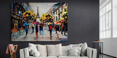
A colorful landscape, a Parisian street or a travel scene creates a narrative atmosphere. Blue and green hues bring a sense of freshness, while ochre, red and terracotta tones add warmth to a living room with light-colored walls. For a more contemplative feel, explore our landscape wall art.
Flowers and botanical motifs
Flowers add color while maintaining a sense of softness. They pair beautifully with light wood, rattan, linen and green plants. A large floral piece can enhance a main wall, while a series of smaller pieces is better suited to a console table or narrow space.
Animals, Pop Art and street art
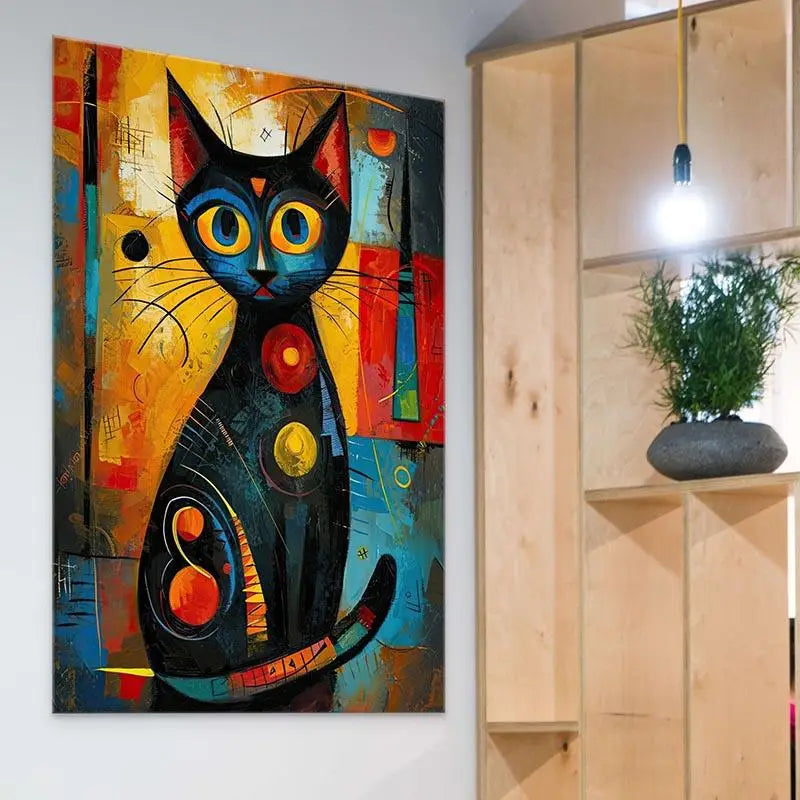
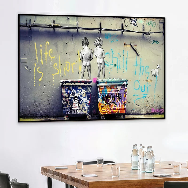
An animal depicted in a graphic style adds character to a warm interior. Pop Art and street art are ideal for those looking for bolder decor. In both cases, limit other patterns around the wall art so the artwork can take center stage as a statement piece. Browse our animal wall art to find inspiration for your living room.

Combining Colors Without Overwhelming the Room
Colorful wall art does not need to be multicolored to catch the eye. Two or three bold shades, carefully balanced, often create a more elegant result than an abundance of colors. Echo one of the artwork's shades in a cushion, throw, or vase, then keep the rest of the room more neutral.
- Beige or white living room: terracotta, deep blue, sage green, or ochre yellow.
- Gray living room: blush pink, red, yellow, turquoise, or touches of warm wood.
- Already colorful living room: a light background, black and white, or wall art with a limited palette.
- Living room with natural wood: earth tones, green, midnight blue, and gold accents.
Consider materials as well. Wood and linen soften highly graphic artwork, while black metal or glass enhance its contemporary character. Balance comes from combining color, texture, and open space.
Choosing the Right Size for Your Living Room Wall
The size of the wall art should be proportional to the wall and the furniture below it. Above a sofa, the artwork can be approximately half to two-thirds the width of the sofa. This proportion creates a balanced composition without making the wall art look too small or too imposing.
- Small format: ideal for a console table, shelf, or gallery wall.
- Medium format: easy to display above a sofa or low cabinet.
- Large format: recommended for an uncluttered wall that is meant to become the focal point.
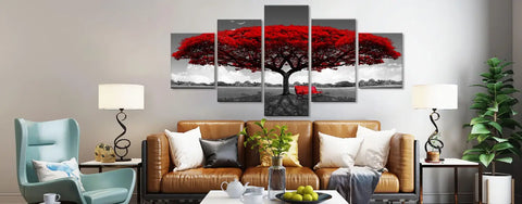
- Triptych or multi-panel wall art: an excellent way to fill a wide space without making the composition feel too heavy.
Before ordering, recreate the dimensions with masking tape or paper. This will help you check the height, width, and space around your future wall art. This simple step prevents proportion mistakes.

Find the ideal location and perfect the lighting
The wall above the sofa remains the most common location, but artwork can also enhance an entryway wall, dining area, or reading corner. The center of the artwork is generally positioned around eye level, taking the furniture and ceiling height into account.
Avoid placing the artwork right against the ceiling or too close to the sofa. Leave some visual breathing room between the furniture and the bottom of the frame. If you are arranging several pieces of wall art, align them along the same axis and maintain even spacing.
Soft lighting to bring out the colors
Natural light often enhances colors, but an adjustable spotlight or picture light can take over in the evening. Choose warm, diffused lighting and avoid direct reflections on a glossy material such as Plexiglass. Test the lighting at different times of day before permanently mounting the wall art.
Compare materials and finishes
The image is not everything: the material affects the texture, sheen, and how the artwork complements your furniture. Your choice depends on your budget, desired style, and where the wall art will be displayed.
- Frameless poster: lightweight and affordable, perfect for easily refreshing your decor.
- Stretched canvas on wooden frame: a warm, matte finish with an authentic painted artwork effect.
- Black floating frame: a contemporary contrast that highlights vibrant colors.
- White floating frame: a softer look, ideal for light-colored walls and pastel palettes.
- Plexiglass: a glossy surface and intense colors, best displayed away from direct reflections.
For your first wall decoration, stretched canvas remains a safe choice. If you are looking for a highly modern finish, Plexiglass or a floating frame can add greater depth to the wall art.
Mistakes to avoid with colorful wall art
- Choosing a size that is too small: it may get lost above a large sofa.
- Using too many bold colors: the eye no longer knows where to rest.
- Overlooking lighting: a dark or glossy piece can lose its depth.
- Ignoring proportions: wall art hung too high or too low can make the wall look unbalanced.
- Mixing too many styles: maintain a common theme between the frames and subjects.
The best choice is one you will enjoy for years and that suits your lifestyle. Successful décor is not copied from a catalog: it should reveal something about your personality while remaining enjoyable every day.
Frequently asked questions about colorful living room wall art
What color wall art should you choose for a gray sofa?
A gray sofa works with many color palettes: terracotta, yellow, deep blue, green, powder pink, or red. Echo just one of these shades in a cushion or rug to create a harmonious look.
How wide should wall art be above a sofa?
A piece between half and two-thirds the width of the sofa is a good starting point. Always measure the wall and test the size with paper before ordering.
Is colorful wall art suitable for a small living room?
Yes. Choose a well-proportioned size, a light background, and a few carefully selected colors. A slim triptych or a small gallery wall can also decorate the space without making it feel smaller.
Canvas or acrylic glass print: which material should you choose?
Canvas provides a warm, matte finish. Acrylic glass prints offer greater shine and depth but require careful consideration of reflections and lighting.
Conclusion: colorful wall art, the touch that transforms your living room
Choosing colorful wall art for your living room means finding the right balance between emotion, proportions, and harmony. Start by considering your color palette, select a style that reflects your personality, then check the size, material, and lighting.
Whether you love abstract art, landscapes, flowers, animals, or street art, a well-chosen piece can add depth to a wall and transform the entire mood of the room. Take the time to compare the options and let your décor tell your story.