
Colorful Zen wall decor can pair a minimalist interior with an image full of character. The idea is simple: maintain a cohesive visual foundation, then let a wall art piece add color, evoke a memory, or bring a touch of nature.
Do you love light-colored walls, wood, and soft interiors, but find your room a little bland? Here is how to choose the colors, patterns, and format of your wall art to create a personalized look without overwhelming your decor.
1. Lay the foundations for colorful Zen decor
In this guide, the word “Zen” describes a minimalist, airy decor style inspired by nature. It does not refer to a meditation method or promise a sense of well-being. The key is to create a space where you enjoy spending time.
Start by observing the lines of your furniture and the objects already in the room. If your sofa, rug, and curtains feature patterns, a simpler wall art piece can balance the overall look. Conversely, a room with plain surfaces offers more scope for a colorful composition.

Leave space around the wall art
A wall does not need to be full to feel decorated. Leaving space around an image helps define its contours and showcase its composition. Before adding multiple frames, try a single wall art piece in the right size: it may be all you need to set the tone for the entire room.
Also, leave enough space to move comfortably around the furniture. Cohesive wall decor should complement the entire room, not just look good in a front-facing photograph.
2. Choose a harmonious color palette
For colorful Zen decor, start with the elements that are difficult to change: flooring, sofa, and large cabinets. Then choose a light or natural base, a secondary shade, and an accent color. This method creates a cohesive look without making your interior feel uniform.
Sage green, gray-blue, or soft terracotta can be appealing options depending on your taste. A color's effect also depends on its saturation, the area it covers, and the light. A deep blue detail does not create the same effect as a large, highly contrasting blue background.
| Base | Accent color | Wall art idea | Echo in the room |
|---|---|---|---|
| Off-white and light oak | Sage green | Botanical landscape or foliage | Solid-color cushion or ceramic piece |
| Beige and natural linen | Terracotta | Abstract composition with rounded shapes | Small terracotta vase |
| Greige and wood | Gray-blue | Ocean horizon or misty mountains | Subtle blue throw |
| Ivory with black accents | Ochre | Bright graphic composition | Gold or ochre decorative object |
Use the brightest colors as accents
Do you love pink, orange, or turquoise? You can incorporate them into the wall art while limiting their use elsewhere. Choose one dominant color from the artwork, then echo it in a single accessory. Let the other shades remain unique to the image.
3. Find the right wall art for your style
The subject should appeal to you just as much as the colors. An image chosen solely because it matches the sofa may leave you feeling indifferent. Think of a place you love, a composition you enjoy looking at, or a motif that holds personal meaning for you.
A landscape to broaden the perspective
A horizon, forest, or landscape contours can bring a sense of depth to a wall. For an understated look, choose an uncluttered composition with soft color transitions. Explore landscape wall art to compare these different moods.
An abstract composition to play with shapes and colors
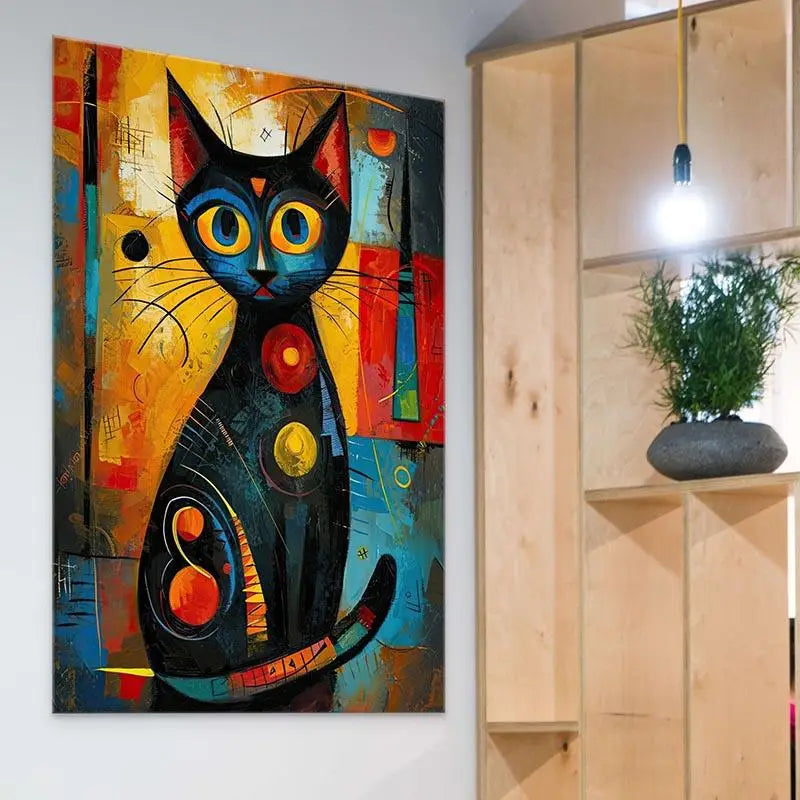
Curves, blocks of color, and flowing lines create a palette without depicting a specific place. In a room already filled with objects, a composition featuring a few large shapes can be easier to integrate than a highly detailed design. Explore abstract wall art, paying equal attention to light spaces and colors.
Buddha wall art if this depiction resonates with you
A depiction of Buddha can complement your decor if you appreciate its subject and meaning. It is not essential for creating a minimalist atmosphere. Choose it carefully, then check whether its composition and colors suit your interior.
The Buddha wall art collection is a great place to explore this theme. Compare the images from the same location where you plan to display the artwork, rather than choosing based solely on a quick glance at a thumbnail.

4. Coordinate materials and finishes
Wood, linen, ceramics, or woven textiles can complement nature-inspired wall decor. You do not need to use them all: repeating two or three materials in moderation is enough to create a cohesive space.
Also distinguish between the texture depicted in an image and the actual product texture. A print may feature a stone, wood, or thick-paint effect without having that raised texture to the touch.
Which finish should you choose for your wall art?
- Frameless poster: it lets you choose the frame. Include framing in your budget if you would like to add one.
- Stretched canvas on wooden frame: it adds depth to the wall art and requires no additional framing.
- Black or white floating frame: black creates a more defined border, while white can blend subtly into a light-colored wall.
- Plexiglass: its glossy finish creates a contemporary look. Check for reflections in your chosen location.
Available options depend on the design. Compare the price for your preferred material and size. If you are looking for environmental information, rely on verifiable product features: a natural appearance alone is no guarantee.
5. Arrange the wall and its lighting
Choose the main wall art first, then decide whether the wall needs any other elements. A large mirror, several shelves, and a highly colorful artwork can compete for attention. Try a simpler arrangement before adding more.
Check the dimensions before hanging
Measure the available width and make a paper template. Position it on the wall using adhesive suitable for the wall's finish, then view the result from the entrance and seating areas. Above a sofa, a width close to two-thirds of the furniture can serve as a starting point, to be adjusted to suit the room.
For multiple frames, maintain even spacing and one unifying element: color palette, finish or theme. Include the gaps when calculating the total width. Finally, use mounting hardware suited to the weight of the wall art and the type of wall.

Lighting without creating distracting reflections
Observe the wall at different times of day to identify direct sunlight. Indirect light often makes the image easier to appreciate. In the evening, adjust a directional lamp from your usual viewing position, especially for a glossy finish.
Keep the intensity moderate and avoid leaving lights on unnecessarily. An LED bulb does not eliminate the need to consider exposure time or the proximity of the light source. The aim is to enjoy viewing the artwork in the room's actual ambience.
6. Adapt the decor to the living room, bedroom and home office
In the living room: coordinate the wall art with the furniture
The wall above the sofa is one option, but a console table or a section of wall visible as soon as you enter can also showcase the wall art. With a beige sofa, try an image with touches of green or blue, echoed subtly in the textiles. Keep small objects away from the main area of the artwork.
In the bedroom: choose a composition you will enjoy seeing every day
A gentle landscape or a low-contrast abstract piece can complement understated decor. Choose according to your preferences, without assuming that a color will automatically improve sleep. Also consider bedside lamps and ensure the wall art is securely mounted above the bed.
In the home office: preserve your visual comfort
A colorful image can add a personal touch to the wall behind or beside your desk. If the patterns are too distracting while you work, place the wall art on a side wall. Keep useful surfaces clear: the wall art should complement your workspace.
7. Personalize and care for your décor
Add an object that means something to you: a travel souvenir, a piece of pottery, or a textile. Connect it to the wall art through color or material. You can update the accessories over time without replacing the entire décor.
For care, follow the instructions for the chosen format. Dust gently when the finish allows, avoid abrasive products, and never spray liquid directly onto the image. Protect sensitive materials from moisture and heat.
Frequently asked questions about colorful Zen wall décor
Can you create Zen décor with bright colors?
Yes. A neutral base allows you to reserve the brightest shades for the wall art or a few accessories. The balance mainly depends on how many colors and patterns are visible together.
Do you need Buddha wall art to create a Zen atmosphere?
No. A landscape, botanical illustration, or abstract piece can also complement a minimalist interior. Choose a subject that reflects your taste.
Which wall art should you choose for a small living room?
Measure the wall and test a paper template. One well-proportioned piece of wall art can look more balanced than several small frames. Consider the viewing distance and nearby furniture.
How can you avoid an overly cluttered interior?
Keep one main focal point, limit repeated colors, and leave some open space. Temporarily remove a few accessories to see what is truly necessary.
Which format is best for understated décor?
Stretched canvas and a floating frame are two options worth comparing. A framed poster may also work. Consider the thickness, finish, and any potential glare before making your choice.
Choose the wall art that sets the tone
Start with an image you love, then build your color palette around it. A landscape, an abstract piece, or Buddha wall art can become the starting point for a personal, harmonious interior.
Explore Buddha wall art