
Colors and patterns in contemporary decor: trends and tips for a harmonious interior
Contemporary decor likes to play with contrasts: clean lines and graphic patterns, neutral tones and vibrant colors, minimalist furniture and artworks designed to instantly catch the eye.
When used well, colors and patterns can completely transform a living room, a bedroom or an entryway without necessarily changing all the furniture.
But how do you pair a soft beige with a pop color? How to incorporate geometric patterns without overwhelming the room? And how to choose a contemporary wall art piece that naturally connects the different shades of your decor?
Here are our tips to create a modern interior, cohesive and above all personal.
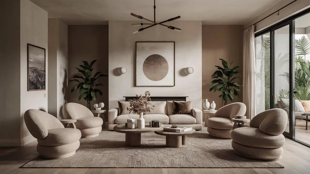
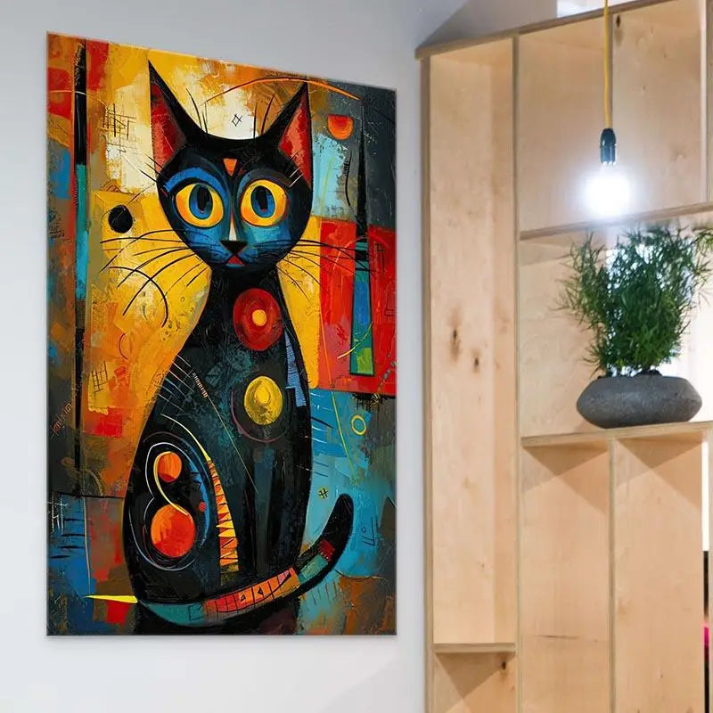
Start by choosing a dominant color, add one or two secondary shades then use patterns as visual accents. If your furniture is already very graphic, choose simpler wall decor simpler. Conversely, a neutral interior can accommodate a large abstract wall art piece, Pop Art or contemporary with intense colors.
1. Which colors should you choose for contemporary decor?
Modern decor does not rely on a single palette.
It can use natural tones as well as much more intense colors. It all depends on the desired atmosphere and how whose different shades work together.
build your palette around a dominant shade and use stronger colors as accents. This hierarchy avoids the impression that every element is trying to attract attention.
2. Neutral tones: the ideal foundation for a contemporary interior
Sand, beige, greige, taupe, off-white and soft gray make excellent foundations for contemporary decor.
Contrary to popular belief, neutral decor is not necessarily monotonous.
It lets you play with textures: linen, wood, bouclé, stone, metal or ceramic can create visual richness without multiplying colors.
A soothing base
Natural tones help create a calm atmosphere and welcoming.
A perfect backdrop for wall art
A light-colored wall offers enough neutrality to welcome a colorful artwork and give it its full presence.
It is often the best backdrop for letting objects and artworks speak for themselves.
3. Pop colors: how to integrate them without overwhelming the room?
Fuchsia, orange, lemon yellow, electric blue or intense green can liven up overly restrained decor.
However, the goal is not to transform each element as a focal point.
Through textiles
A cushion, a throw or a rug can introduce a bold color in an easily reversible way.
Through furniture
An armchair, a chair or a colorful console table can become a signature element.
Through wall art
This is one of the solutions the most effective to add several colors without changing the furniture.
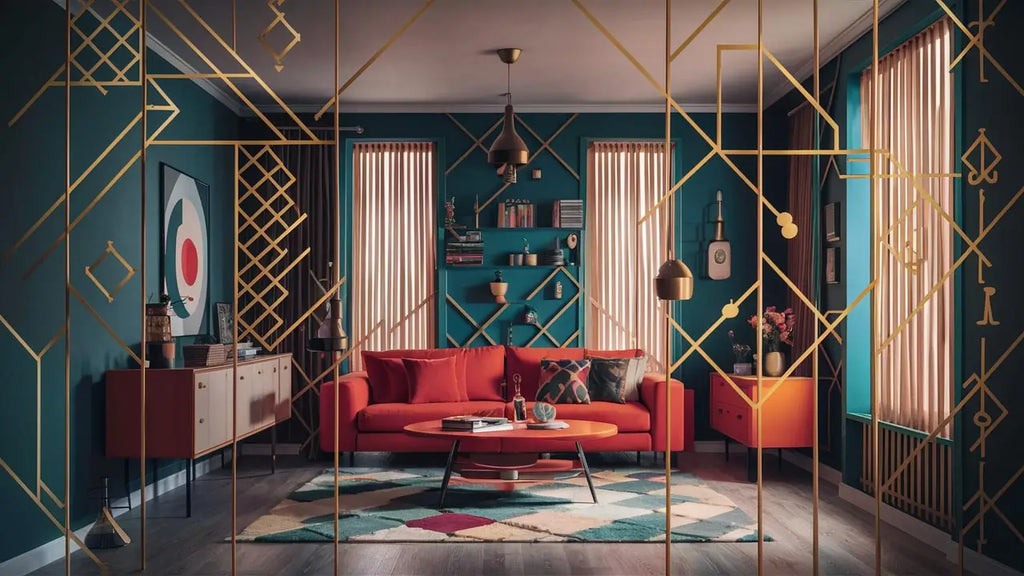
4. Which patterns should you use in contemporary decor?
Patterns help bring rhythm and more personality to a room.
They can appear on a rug, cushions, wallpaper, a curtain or directly in a work of art.
Geometric patterns
Lines, circles, triangles, arches and abstract shapes bring structure and modernity.
Organic patterns
Curves, irregular shapes and natural inspirations help soften overly strict lines.
Floral patterns
In a stylized version, they can perfectly fit into contemporary decor.
Abstract patterns
They bring movement without necessarily representing an identifiable element.
5. Why do geometric patterns work so well?
The circle, the square, the triangle or the diamond have immediate graphic impact.
They structure the visual space and blend easily with the simple lines of contemporary furniture.
| Shape | Visual impression | Decorative use |
|---|---|---|
| Circle | Softness and movement | Mirrors, wall art, lighting |
| Triangle | Dynamism | Graphic art, textiles, objects |
| Square | Structure and stability | Frames, furniture, wall compositions |
| Diamond | Graphic elegance | Rugs, wallpaper, illustrations |
| Irregular shapes | Creativity and freedom | Abstract art and contemporary decor |
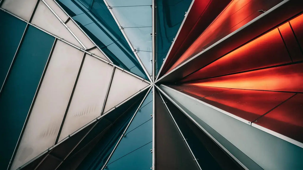
6. How to combine colors and patterns without making a decor mistake?
Success depends on balance between the different visual forces.
Define a dominant color
It can appear on the walls, the sofa or the main pieces of furniture.
Add a secondary color
Use it on a few accessories or in your wall art.
Choose an accent color
Brighter, it should be used with greater restraint.
Vary the scale of the patterns
For example, pair a large pattern with several elements much more understated.
Leave calm areas
Plain surfaces allow patterns to breathe and prevent visual overload.
if your sofa, your rug and your curtains already feature many patterns, choose wall art more refined. If the furniture is plain, you can, on the contrary, allow you to choose a piece much more expressive.
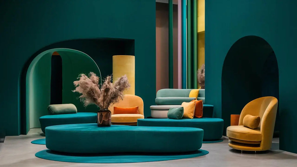
7. The wall: a central element of contemporary decor
A wall is not simply a surface to paint.
It can become a true area of decorative expression thanks to color, wallpaper, mirrors and above all to wall decor.
Plain wall
It is the ideal solution to highlight a graphic artwork or multicolored.
Colored wall
Choose a wall art that interacts with the shade through contrast or through a subtle echo.
Wall with wallpaper
Choose an artwork simpler to avoid creating too much visual competition.
Large white wall
This is the opportunity to dare to choose a wall art large-format that will give a true personality to the room.
8. Which wall art should you choose for contemporary decor?
Wall art is one of the ways the simplest to bring together colors, shapes and influences present in a room.
It can echo a secondary shade of the sofa, introduce contrast or deliberately become the main focal point.
Contemporary wall art
Ideal for introducing current shapes, balanced colors and a modern aesthetic.
Abstract wall art
Perfect for playing with colors, textures and movement.
Pop Art wall art
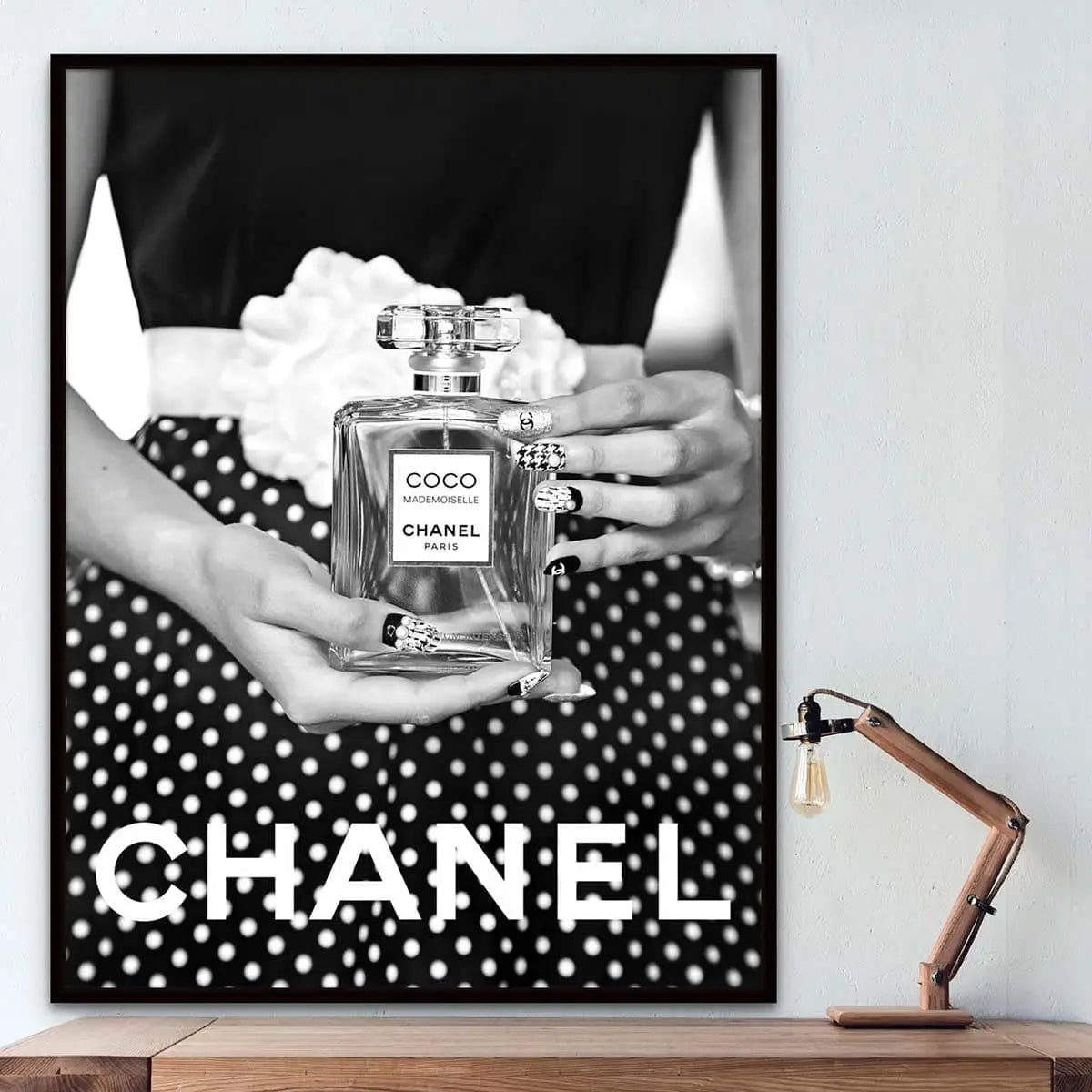
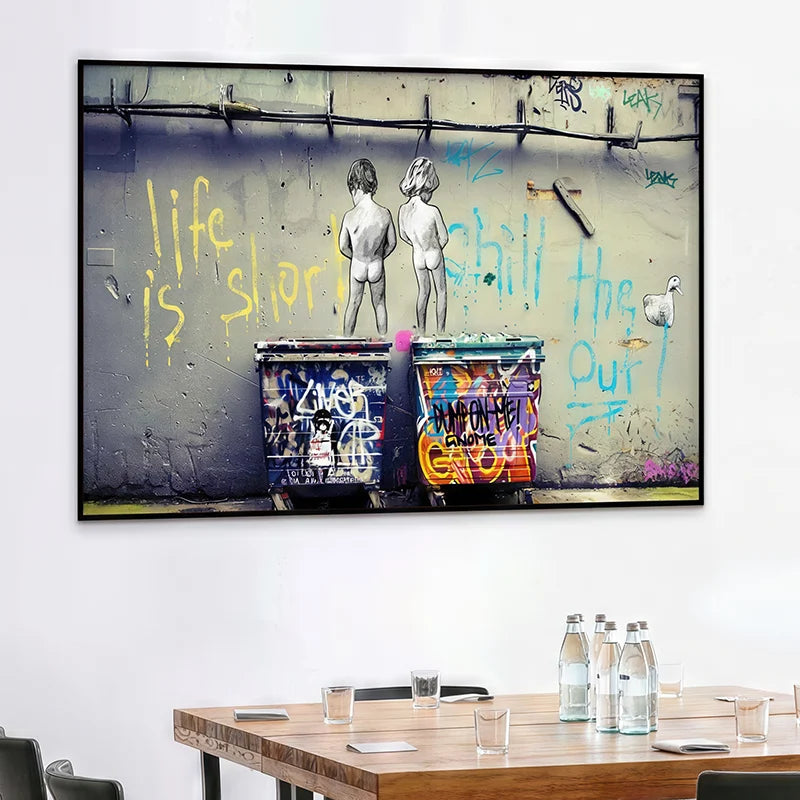
An excellent solution to energize a neutral interior with bold colors.
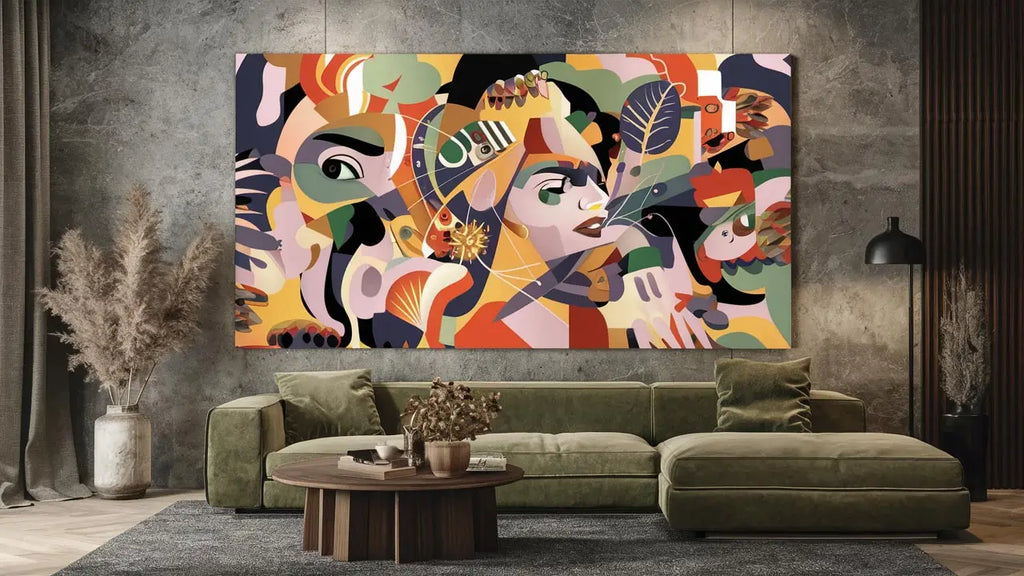
Wall art can give it its identity.
9. How to combine colors, patterns, and wall art in a contemporary living room?
The living room is often the room where you can express most freely its decorative personality.
The sofa, the rug, the cushions and the wall art must work together without necessarily be perfectly matched.
| Living room decor | Recommended wall art | Desired effect |
|---|---|---|
| Beige & wood | Colorful abstract or contemporary | Create a focal point |
| Black & white | Pop Art or colorful artwork | Bring energy |
| Terracotta | Beige, blue, black, or abstract | Create contrast |
| Sage green | White, beige, black, gold | Maintain a natural atmosphere |
| Multicolored living room | More minimalist wall art | Rebalance the overall look |
To go directly toward suitable artworks to this room, discover our Living Room Wall Art collection .
10. Mistakes to avoid with colors and patterns
Multiplying bold colors
Three or four shades very powerful can quickly compete with each other.
Matching everything perfectly
Overly coordinated décor can lose in natural charm and personality.
Mixing too many patterns
Several bold patterns in the same area can tire the eye.
Choosing wall art that is too small
On a large wall, an undersized artwork can seem lost.
Forgetting empty spaces
Empty space is part of the composition. It allows strong elements to breathe.
Following trends only
Your interior must above all reflect your personality.
Explore our collections for contemporary décor
Choosing wall art can be the final step that connects the colors, the patterns and the furniture of your interior.
Is your décor almost complete? The wall can still change everything.
You have chosen the sofa, the colors and materials. Now all that remains is to give a true identity to your space.
Abstract, contemporary, Pop Art or minimalist creation: a well-chosen wall art piece can bring together all the elements of your décor into a single focal point.
Discover Contemporary Wall Art View new arrivalsFAQ: colors and patterns in contemporary décor
What are the ideal colors for contemporary décor?
Beige tones, greige, taupe, off-white, green and terracotta make excellent foundations. They can then be paired with accents brighter such as orange, yellow, blue or pink.
How to combine several colors in a living room?
Choose a dominant color, a secondary color and an accent color. This hierarchy helps preserve balanced decor.
What patterns should you choose for a modern interior?
Geometric, abstract and organic work particularly well. The most important thing is to vary their size and avoid excessive accumulation.
What wall art should you put on a beige wall?
A beige wall allows for many possibilities. Abstract wall art blue, terracotta, green, black or multicolored can create a very beautiful contrast.
What wall art for a contemporary living room?
A large abstract wall art, a graphic creation or a contemporary artwork can perfectly structure the main wall or the space located above the sofa.
Can you mix geometric patterns with abstract wall art?
Yes, provided that not to give the same intensity to each element. If the rug is already very graphic, for example, choose wall art whose the composition remains more fluid.
How to use a bright color without overwhelming your interior?
Use it as an accent on an armchair, a few cushions or a wall artwork. A small amount can be enough to completely transform the mood of a room.
What size wall art should you choose above a sofa?
The wall art should be visually proportionate to the width of the sofa. On a large wall, a generous size generally has more impact than a small isolated piece.
Colors, patterns and wall art: create decor that tells a story
Trends can provide ideas, but they should never entirely dictate your interior.
Contemporary decor works particularly well when it combines a cohesive base with a few elements more personal.
A color, a pattern, a texture or wall art can become the starting point of the entire room.
The secret is therefore not to match perfectly each element, but to create a visual dialogue between your walls, your furniture and the artworks that reflect you.
Find the wall art that will complete my decor