


Jean-Michel Basquiat: from Asphalt to Museums, a Writing of Fire
- The City as the First Page

New York, late 1970s. Subway cars become notebooks, the facades of the southern neighborhoods fill with signs, words, silhouettes. Jean-Michel Basquiat (1960–1988) appears there, almost running, with the energy of a hurried self-taught artist. Before hanging his canvases in galleries, he writes the city: crowns, anatomical bodies, bones, masks, inventories, slogans… His painting is born from a rhythm — that of the street — and a language — fragments jotted down on the fly, corrected, crossed out, rewritten. This tension between urgency and lucidity, between raw gesture and intelligence of references, explains why his work remains so contemporary and so readable today.
An Immediately Recognizable Signature
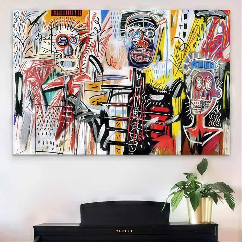
Basquiat has something irresistibly direct. Raw colors, rough flat areas, vibrating lines; then, in the middle, a word, a number, a name. The eye moves like on a mental map: you read as much as you look. Behind the apparent improvisation, there is a very precise construction — superimpositions, erasures, reprises, margins, frames — which gives each canvas the look of an annotated page. The artist borrows from art history, jazz, scientific iconography, magazines, sports, Afro-Caribbean mythologies. His visual alphabet — crown, skull, teeth, bones, boxers, profane saints — works like a system of portable signs, immediately identifiable, but never fixed.
Themes: Identity, Power, Memory
In this theater of signs, Basquiat directly raises questions of representation and power. Who has the right to be seen? Who writes history? The crown, a recurring emblem, sacralizes invisibilized figures and questions the hierarchy of titles and glories. Bodies are open, studied, named — as if science, medicine, encyclopedias had forgotten pieces, and the inventory had to be redone. The scribbled writing, sometimes on the edge of legibility, becomes a counter-discourse: it contradicts, comments, corrects. The work is not an illustration; it is a reply addressed to the world.
From the Street to the Walls: Recognition and Tensions
Basquiat’s rise is meteoric. Galleries, museums, collaborations (the most famous with Andy Warhol): the artist imposes his grammar and shakes up the market. The paradox is well known: coming from the margins, he becomes an icon. People rejoice or worry; but the question lies elsewhere — in the resistance of the work. Despite the stardom, the canvases continue to strike by their relevance: they are made of quotes, current events, striking names, quick replies. They have the speed of an era and the density of a palimpsest. In 2017, an Untitled sold for over 110 million dollars at public auction: a spectacular figure, certainly, but above all a symptom of an influence that far exceeds museums (graphic design, fashion, illustration, music…).

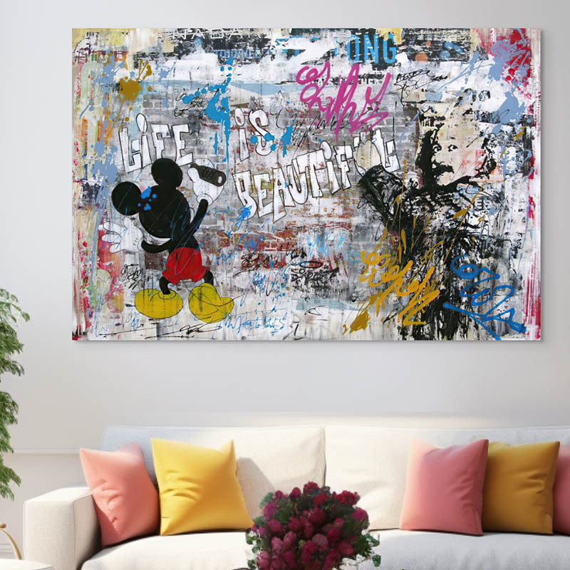
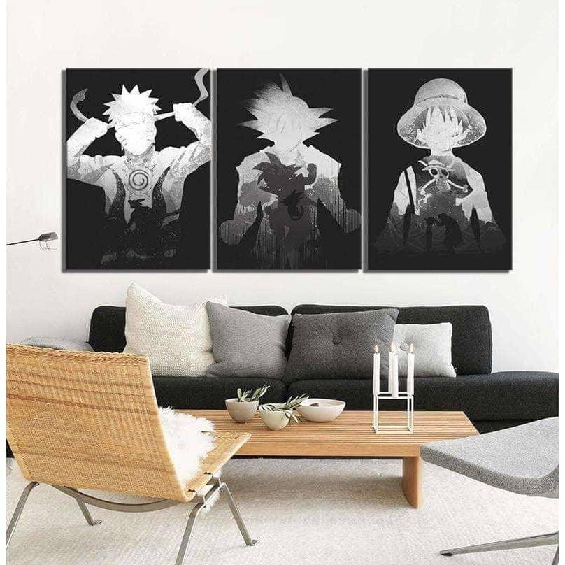
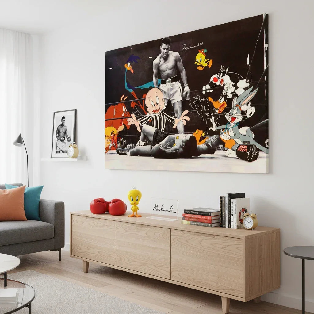
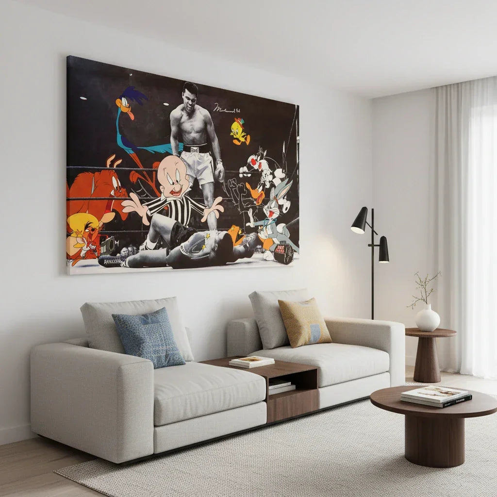
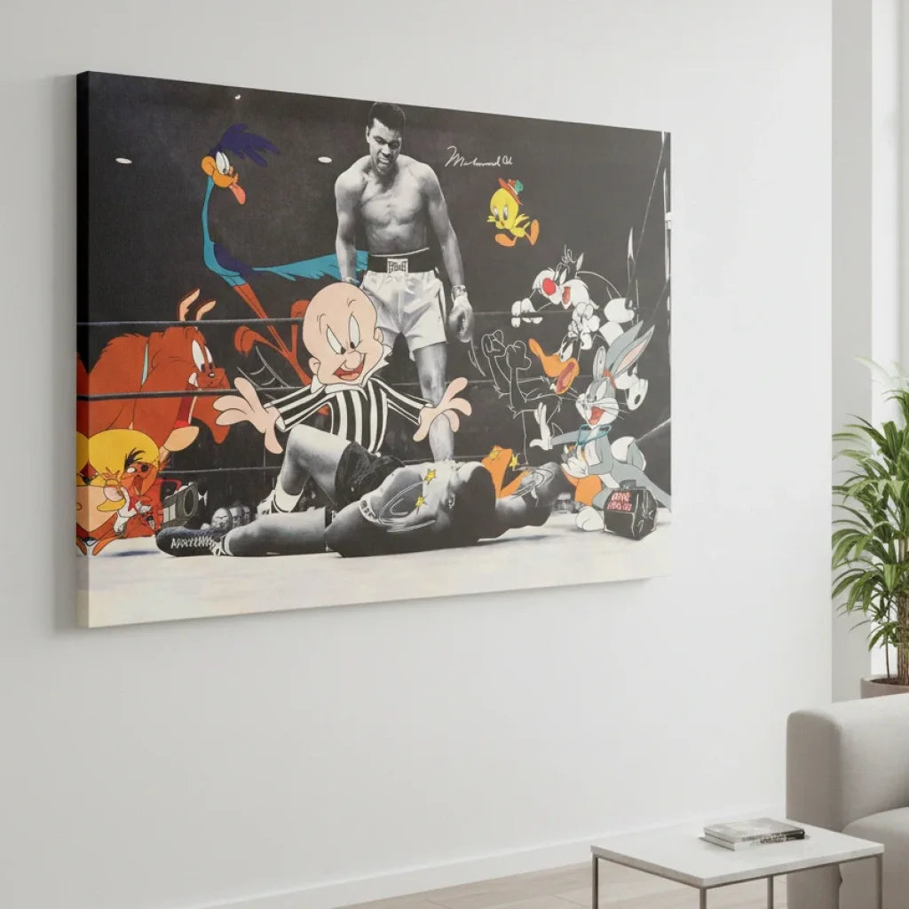
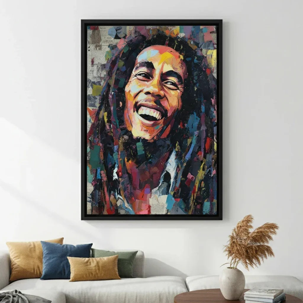
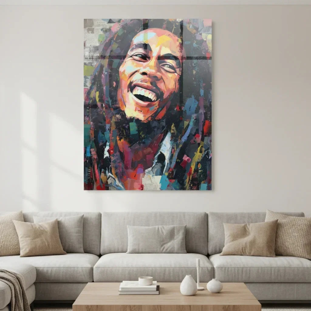
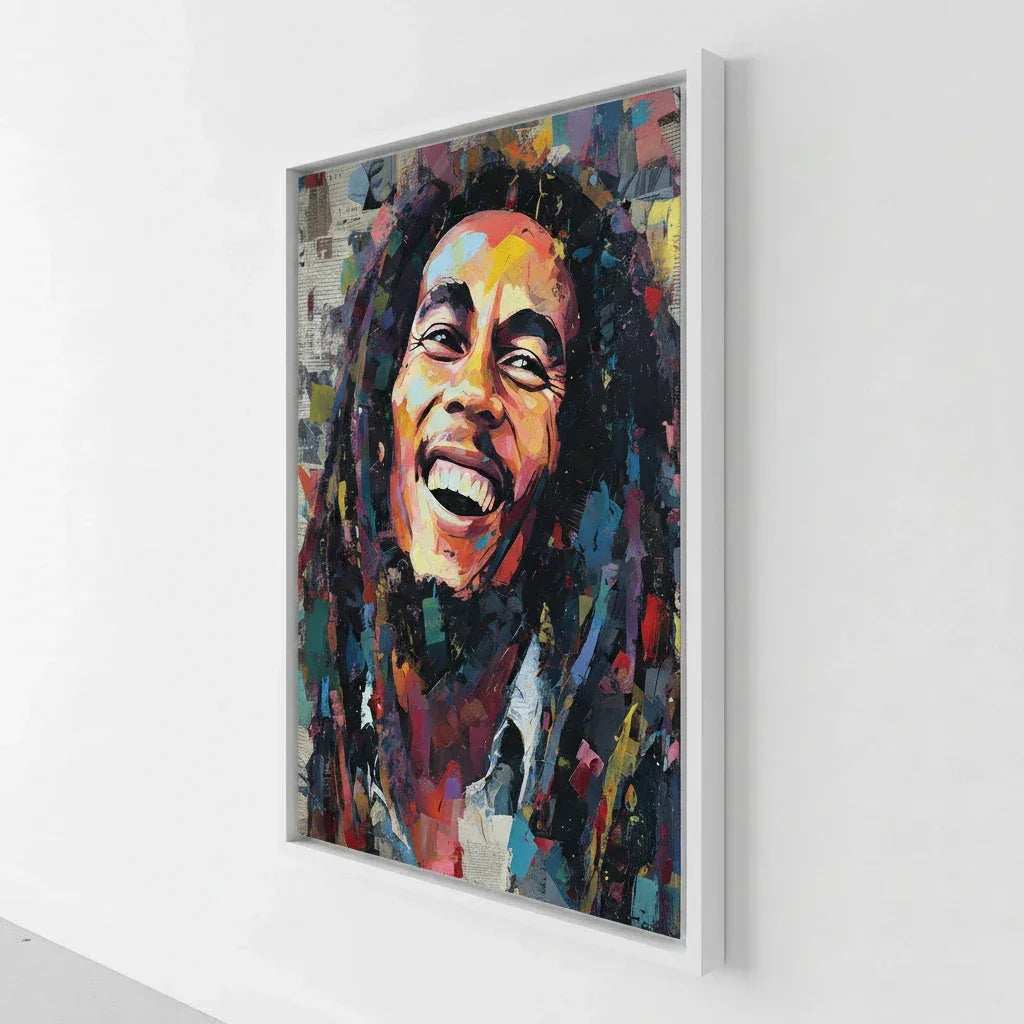
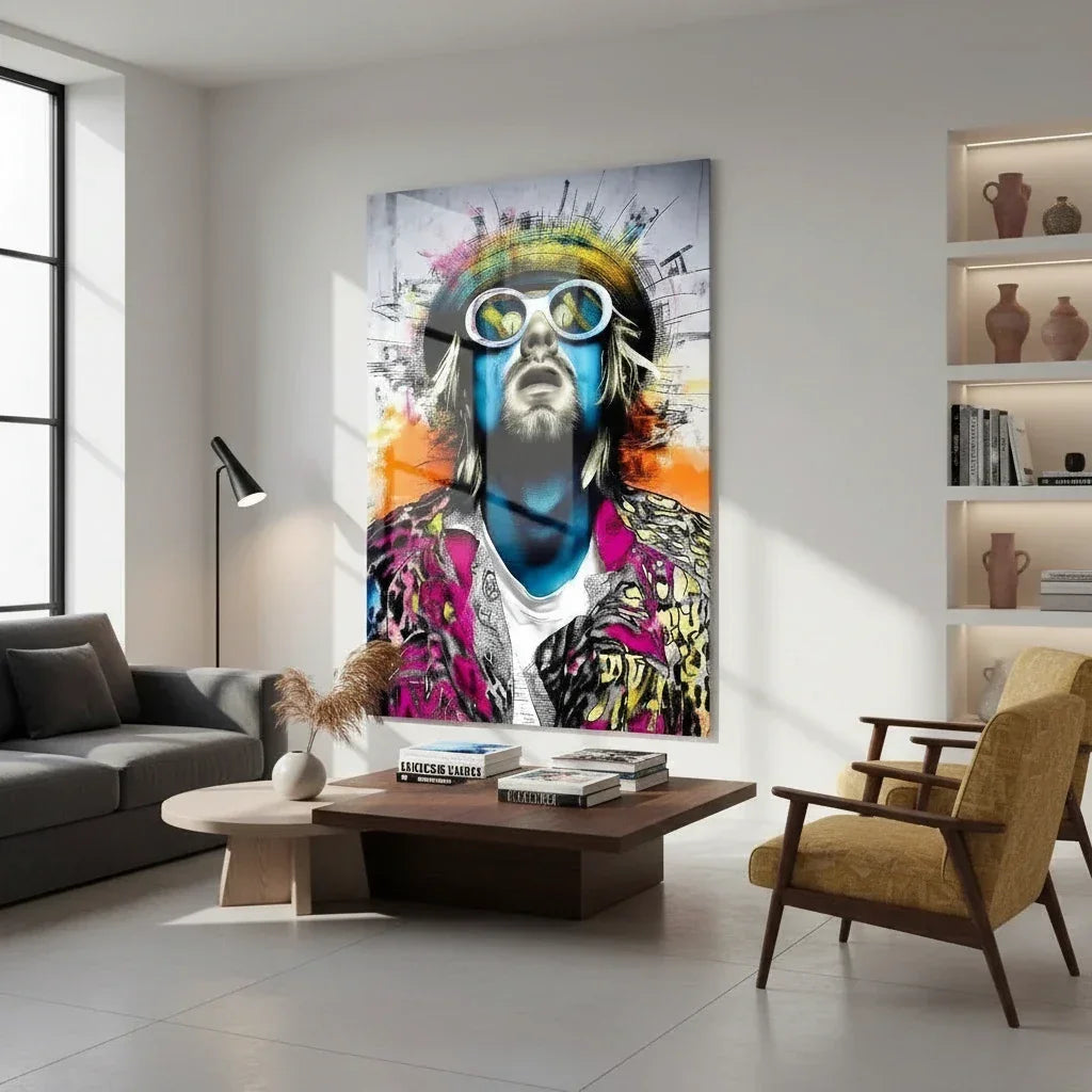
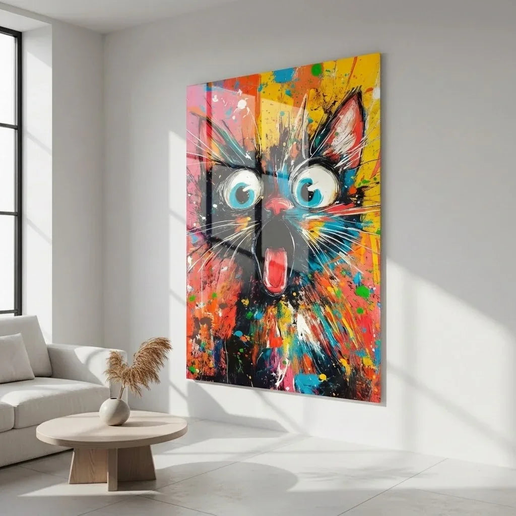
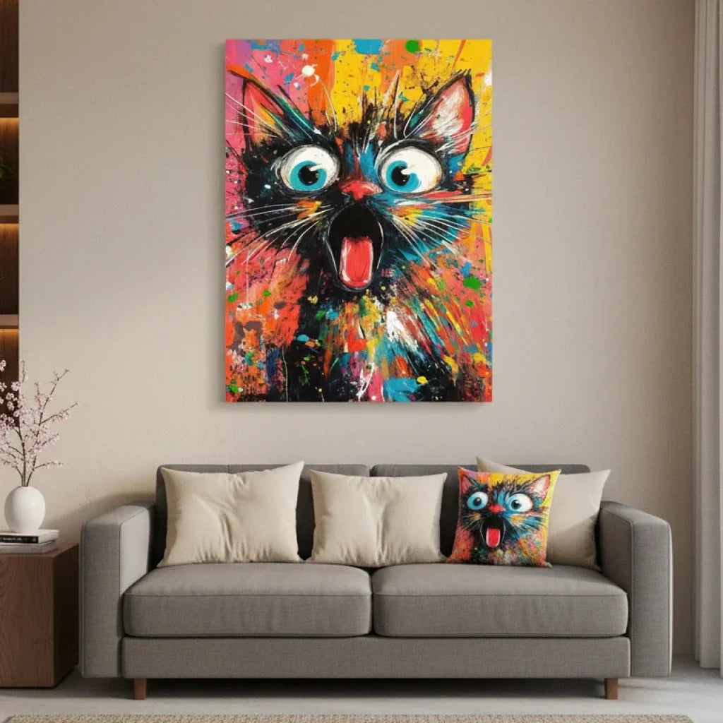
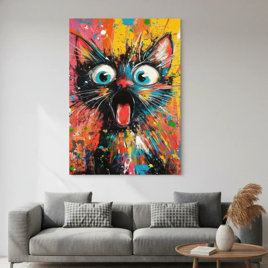
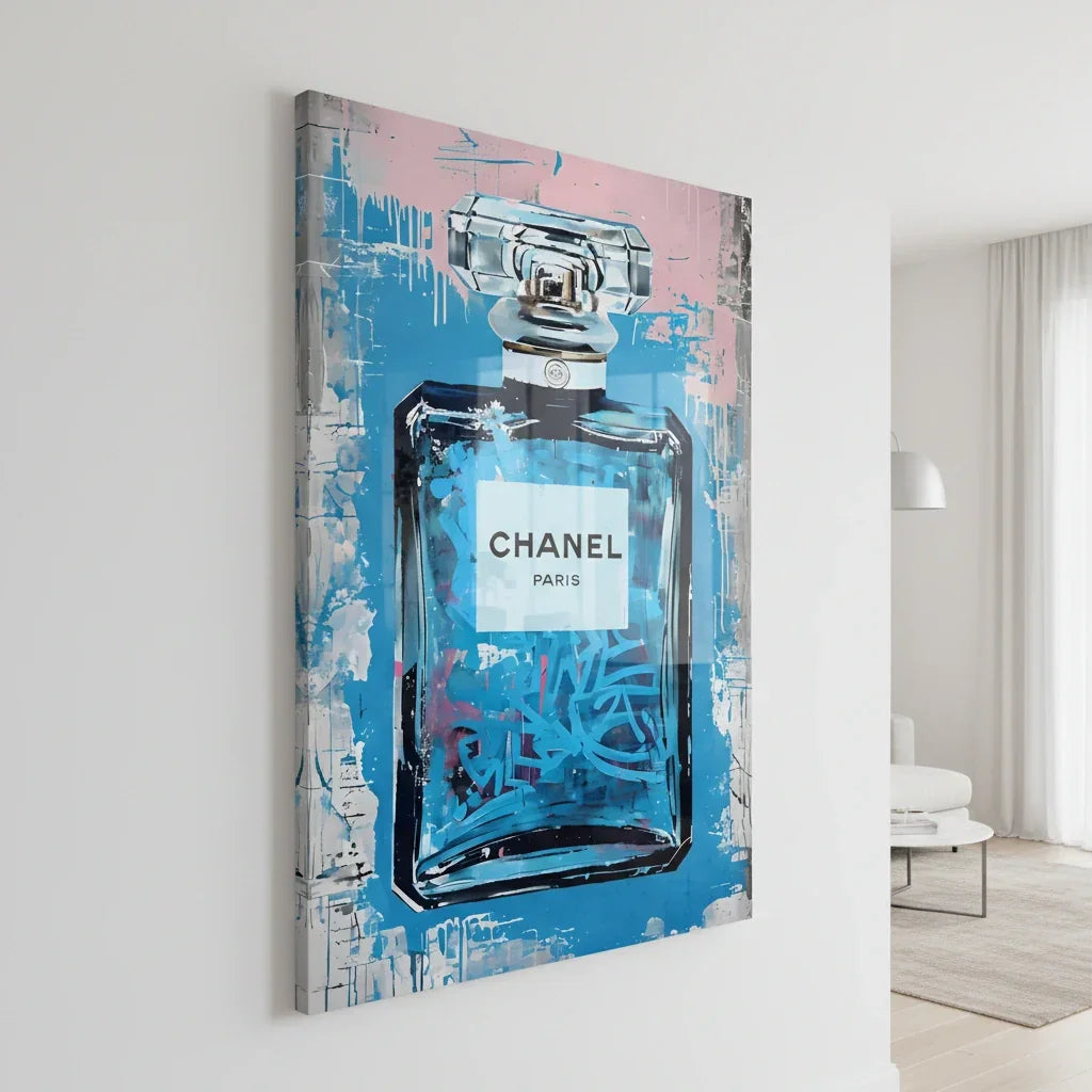
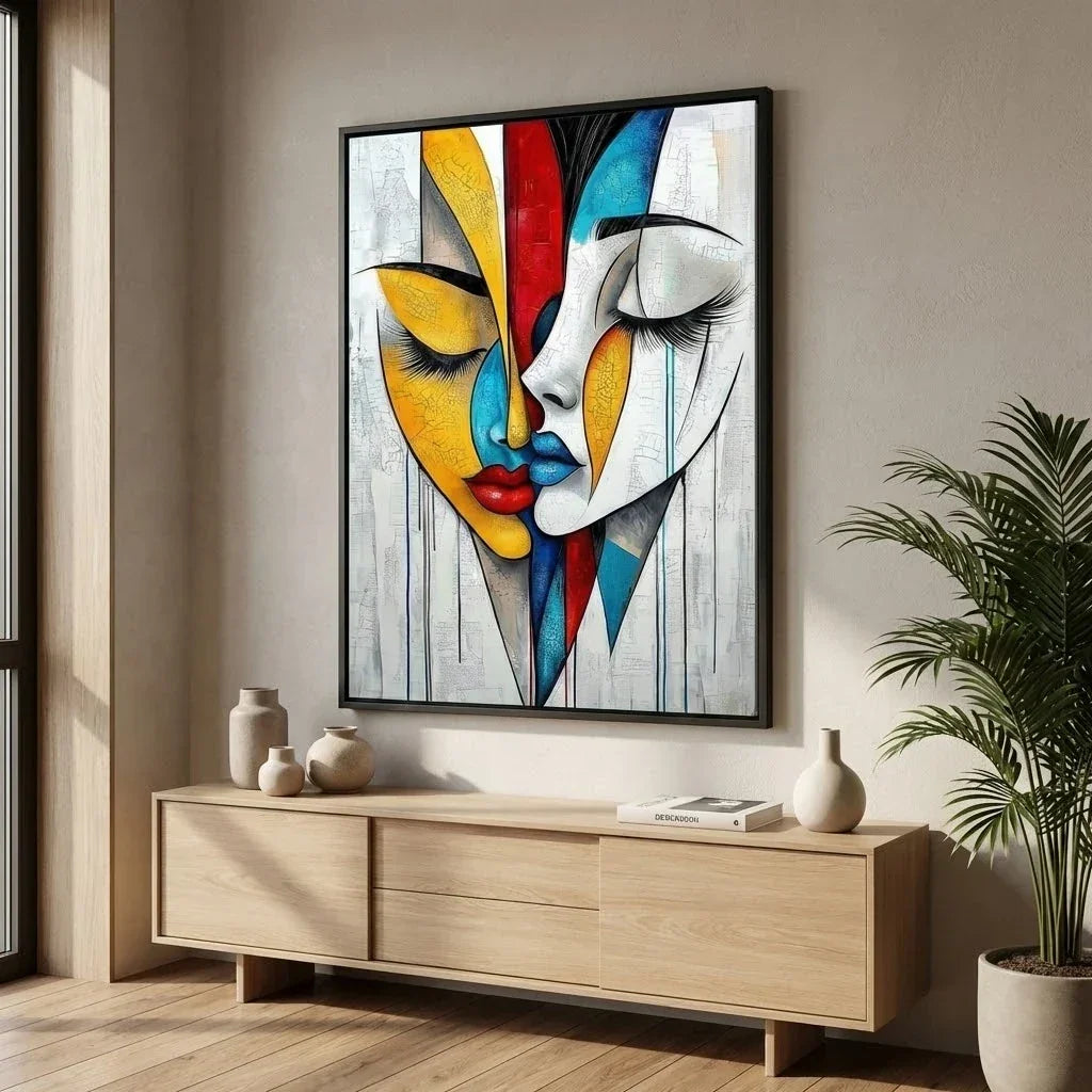
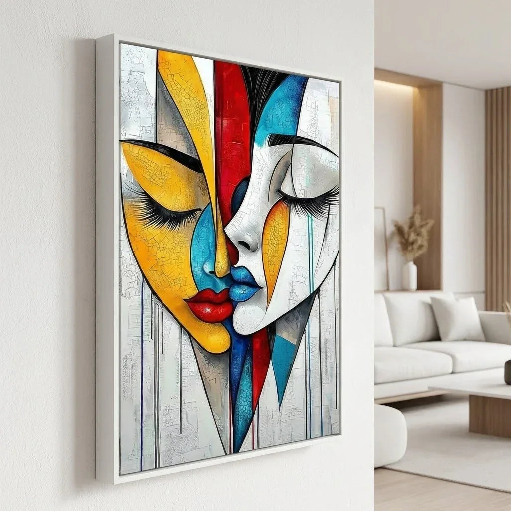
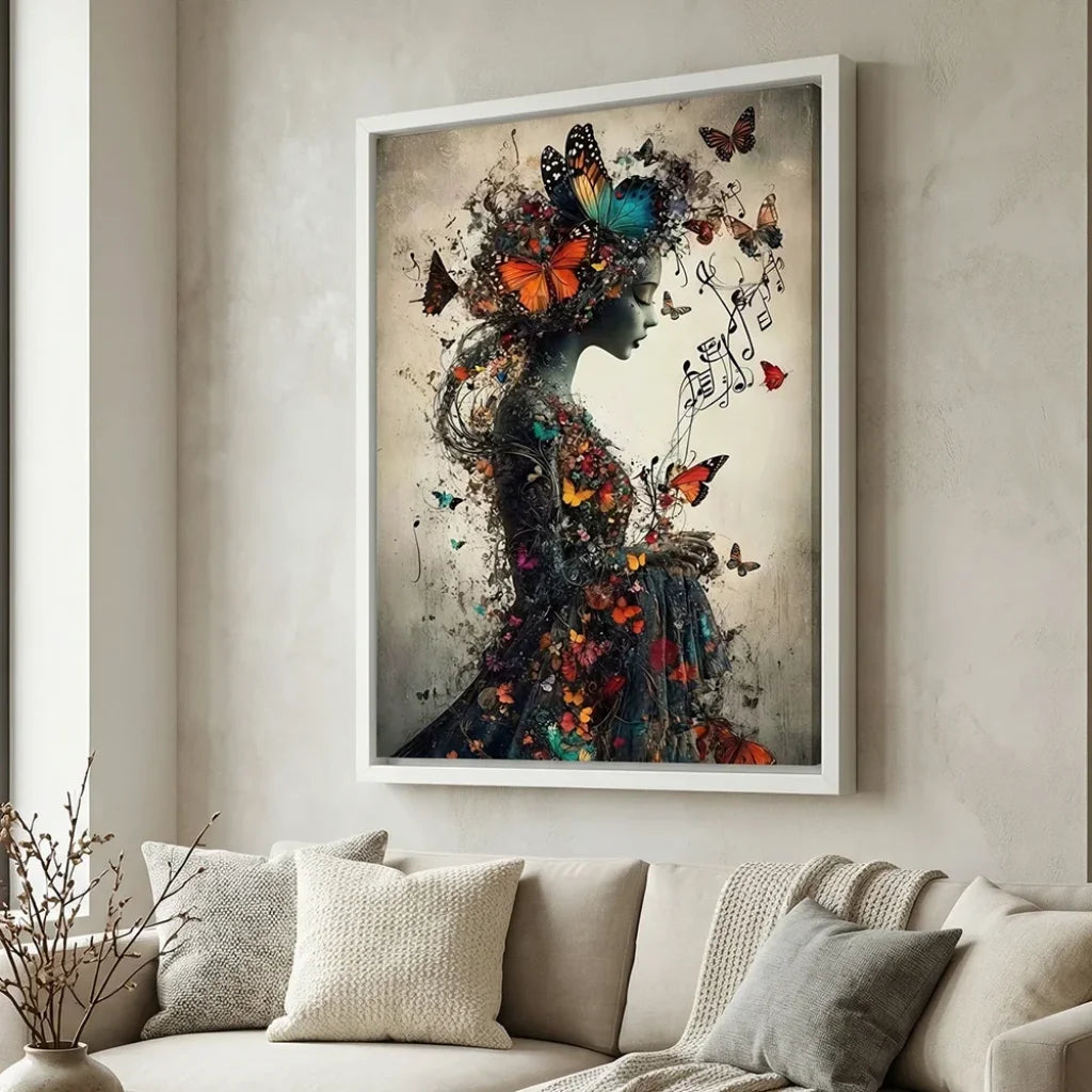
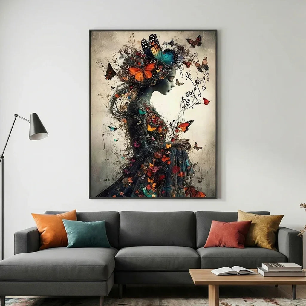
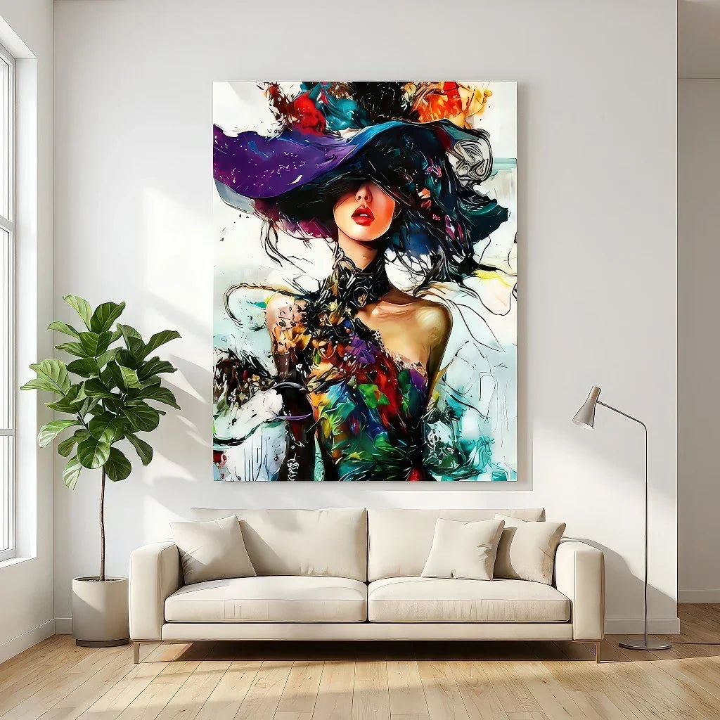
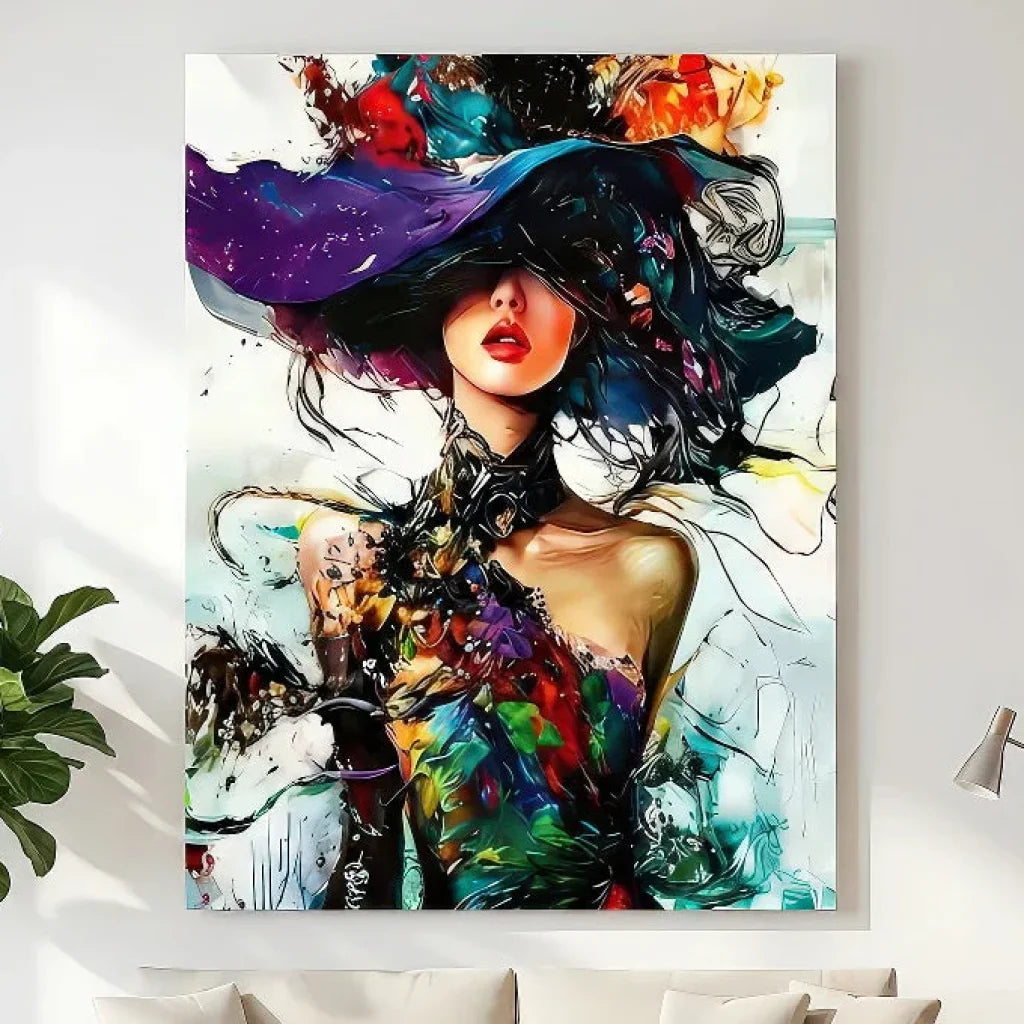
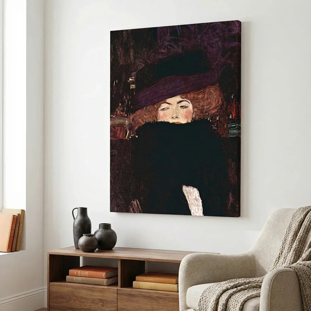
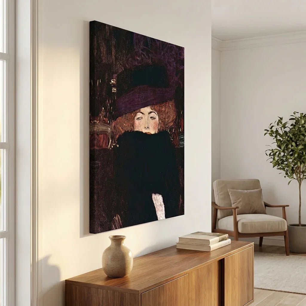
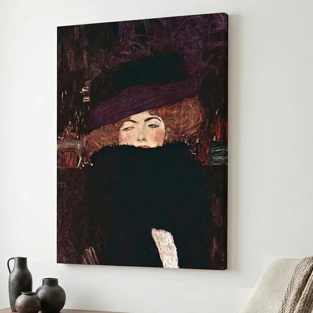
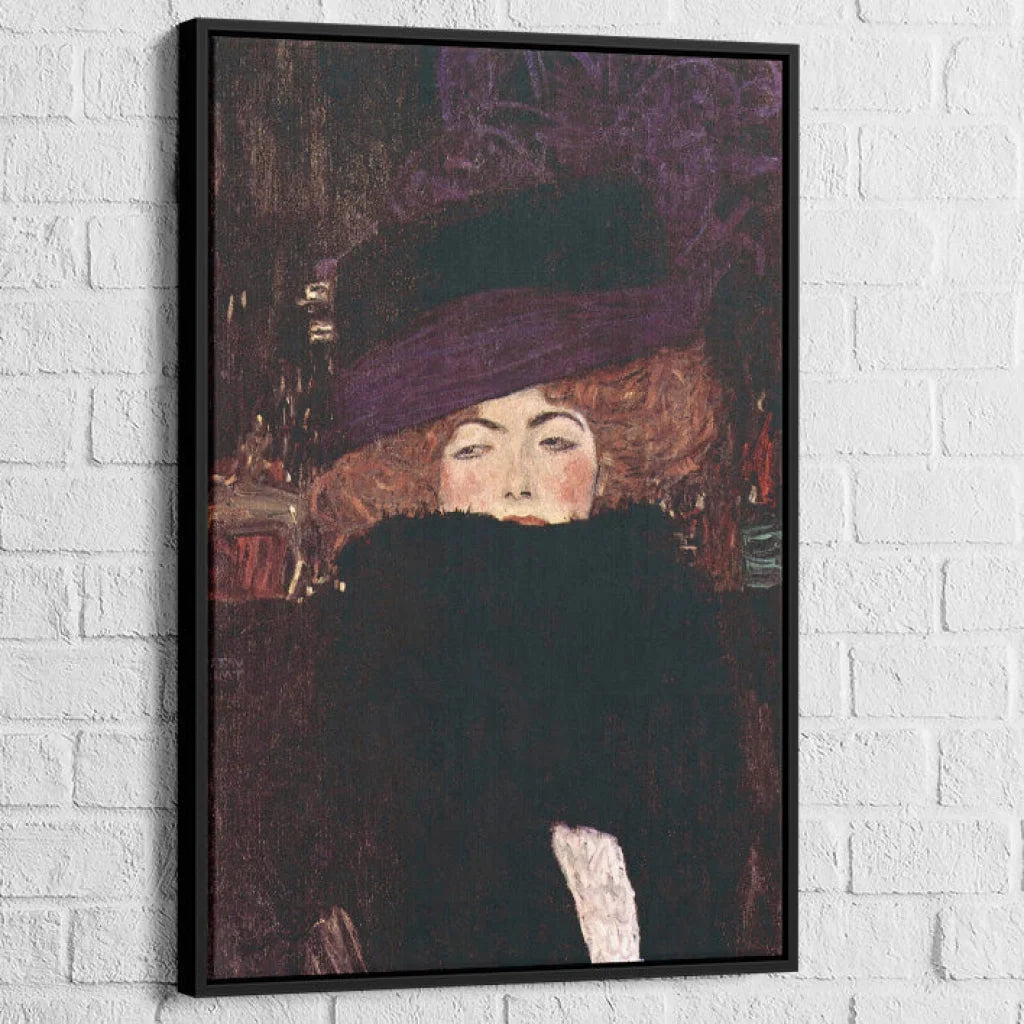
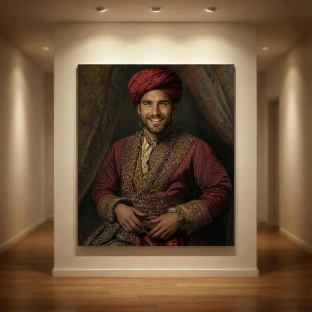
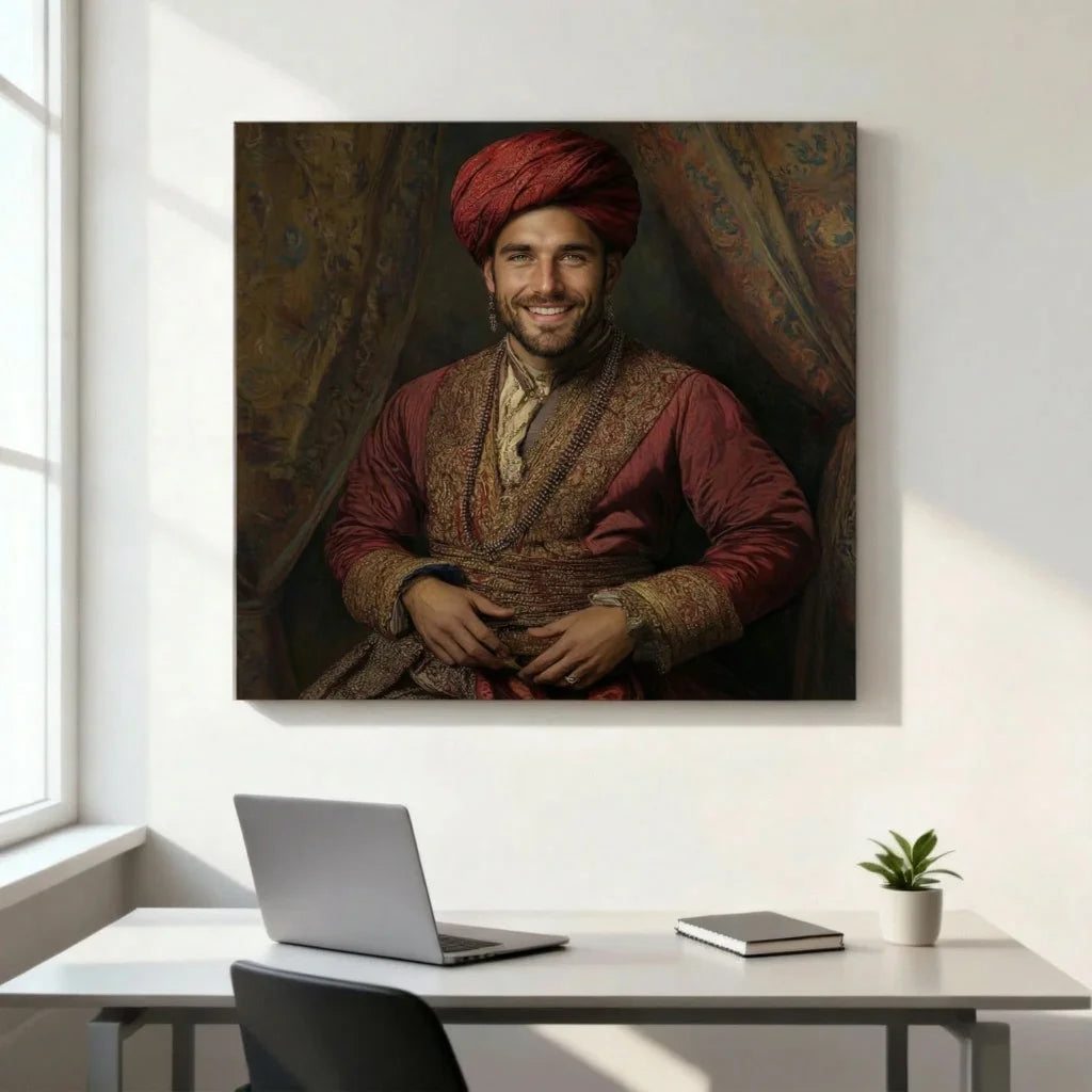
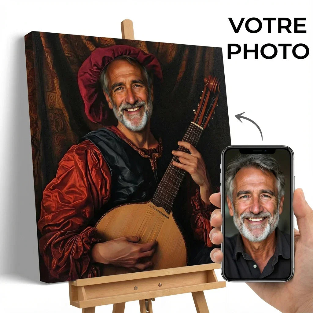
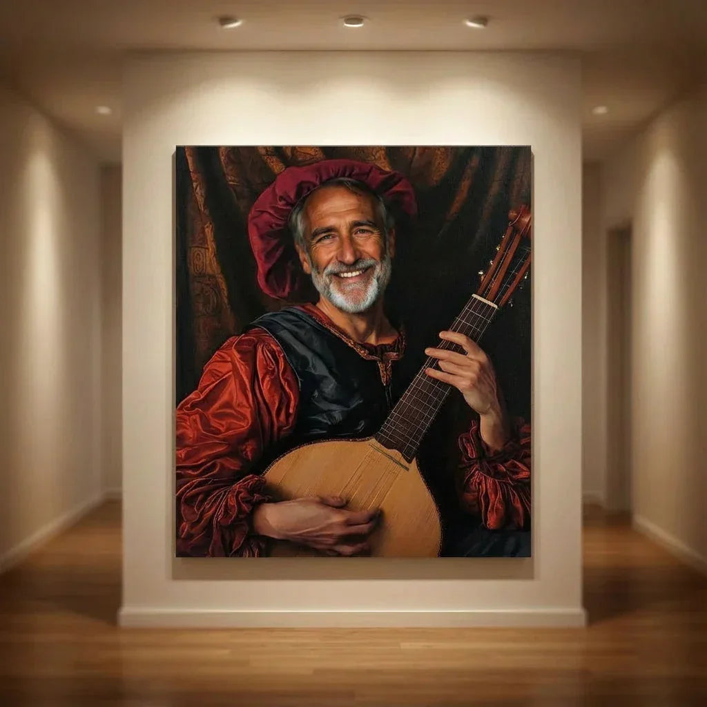
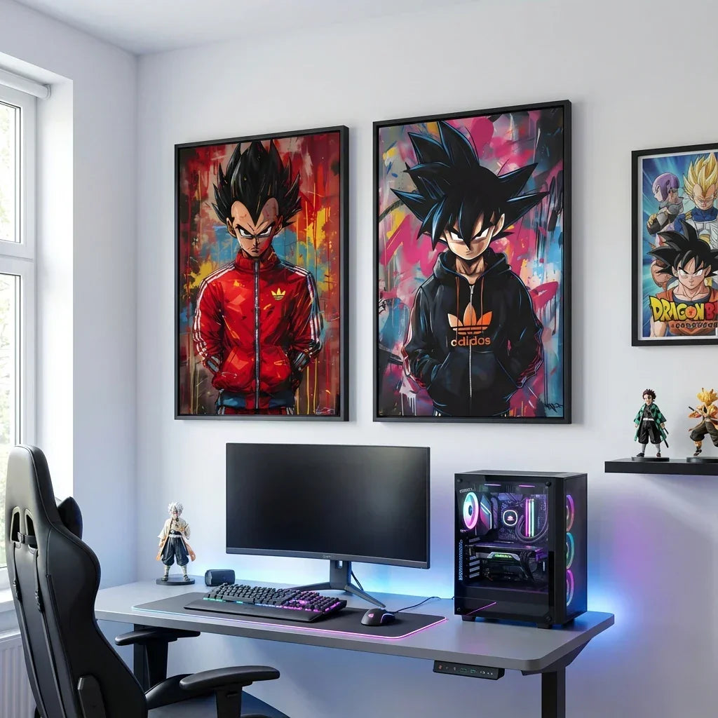
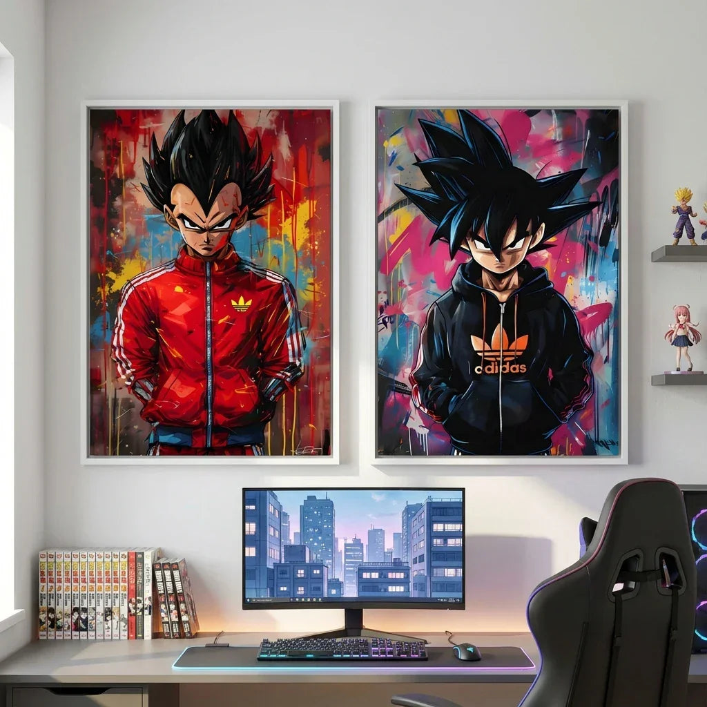
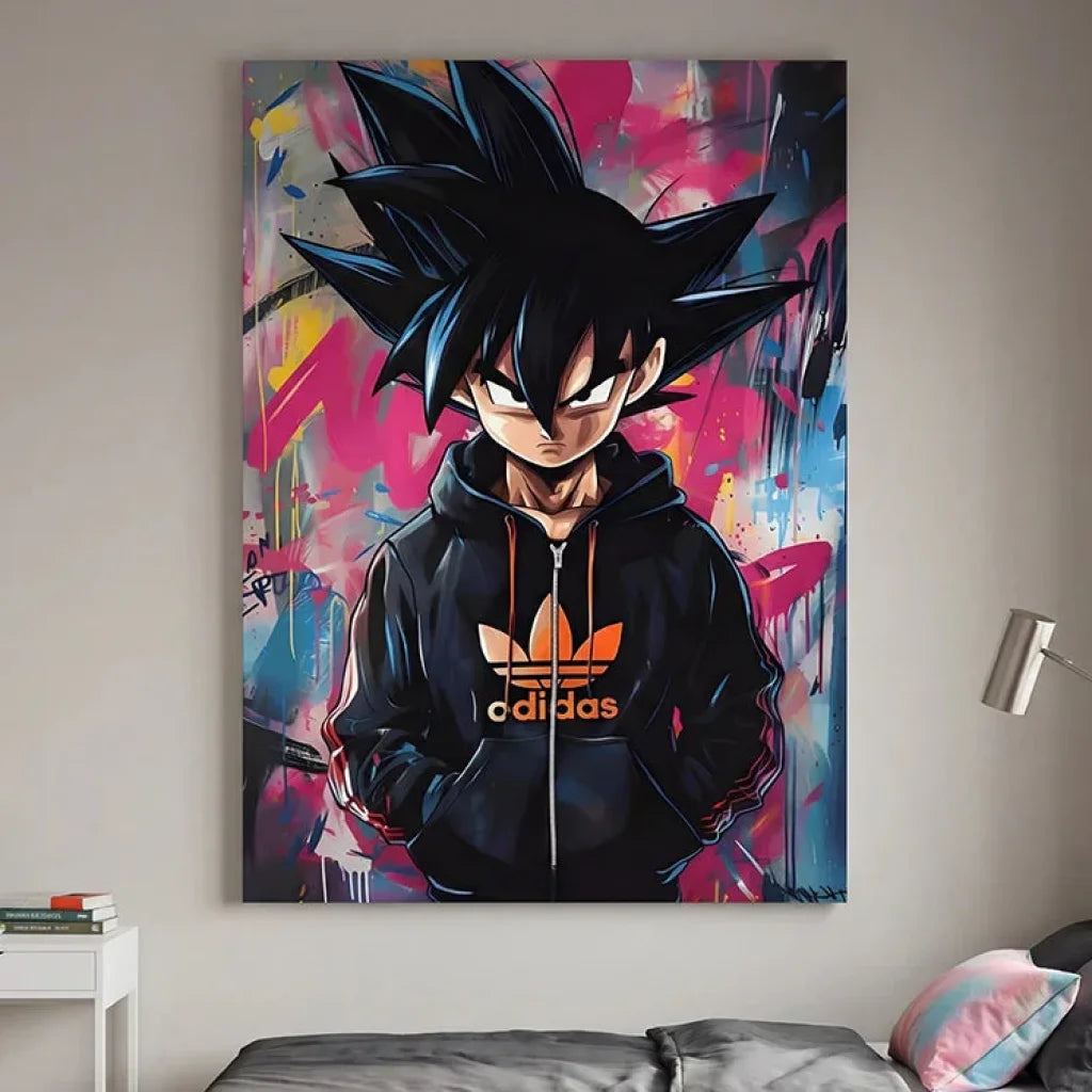
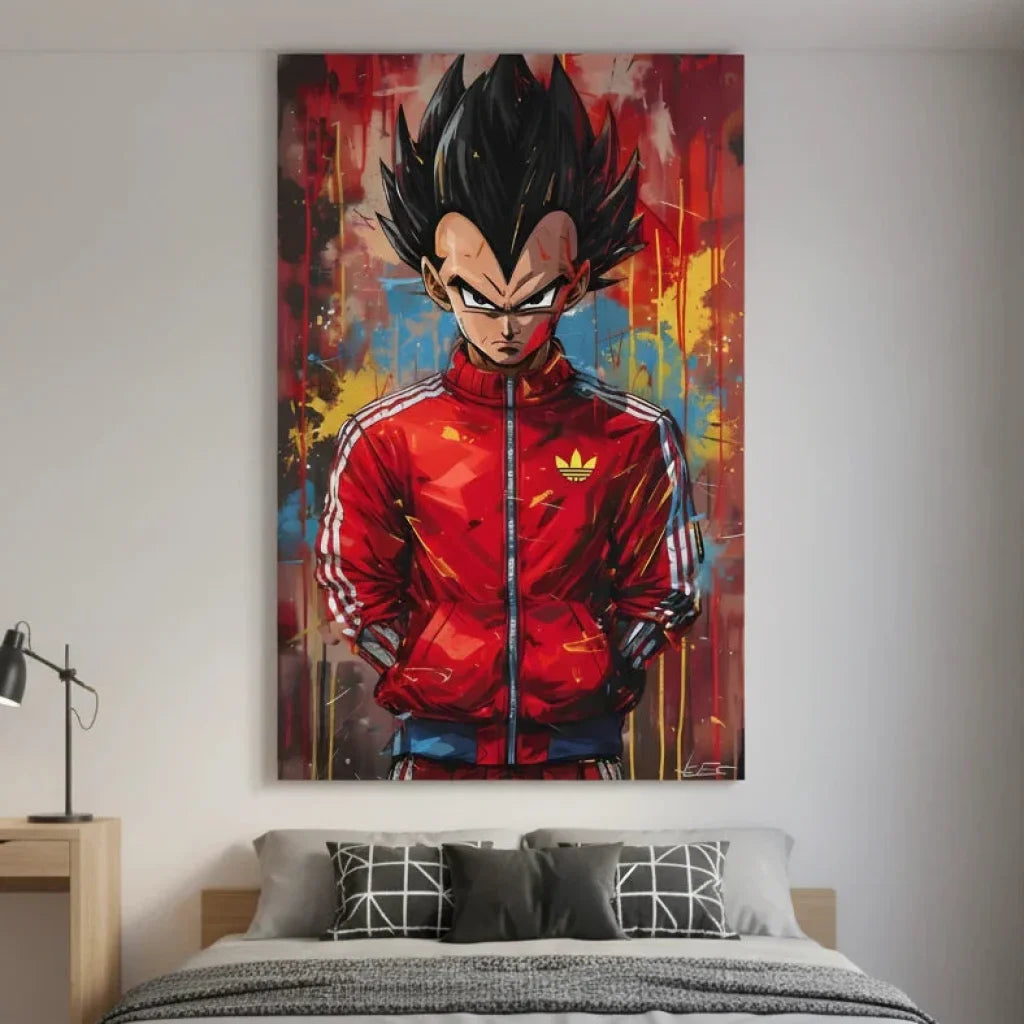
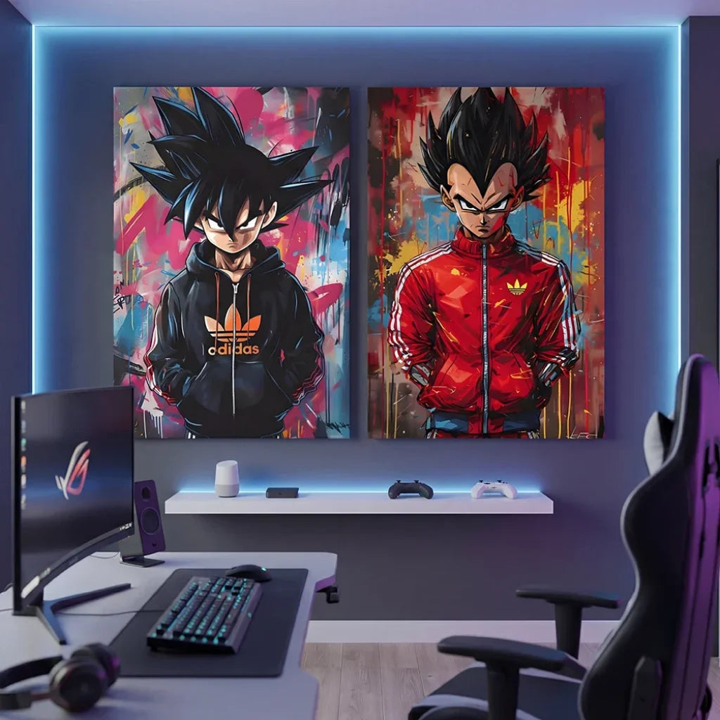
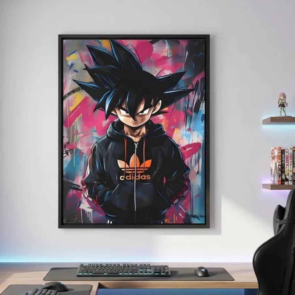
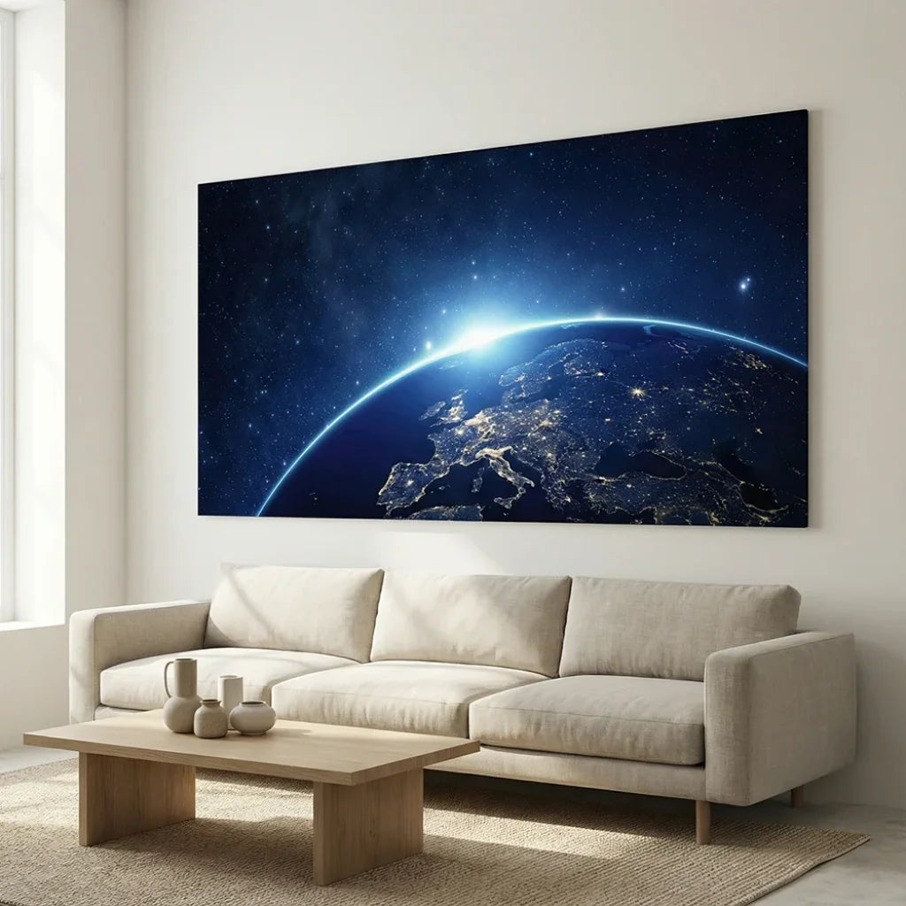
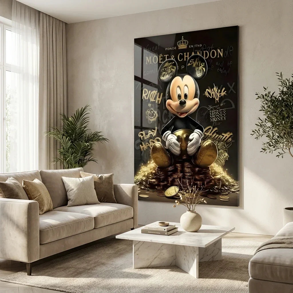
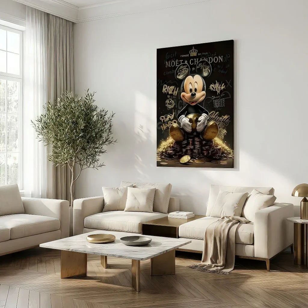
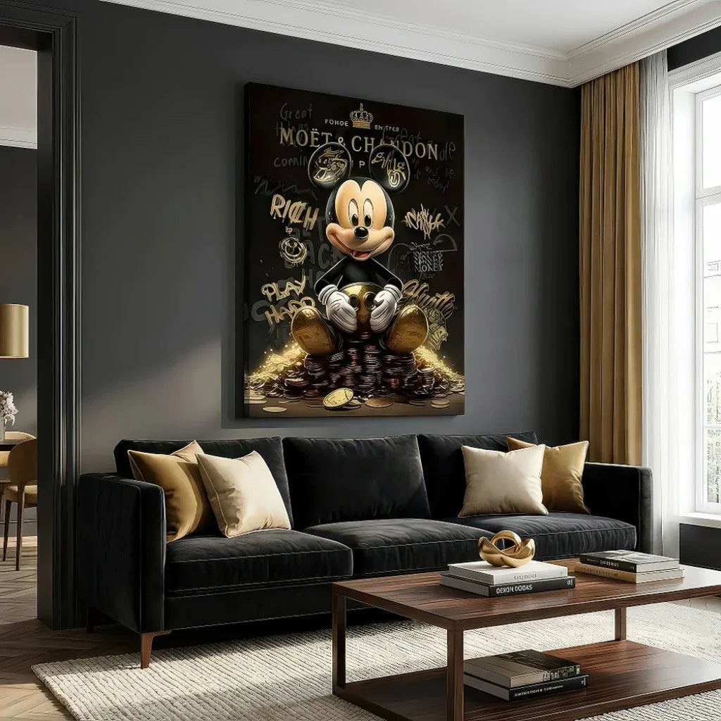
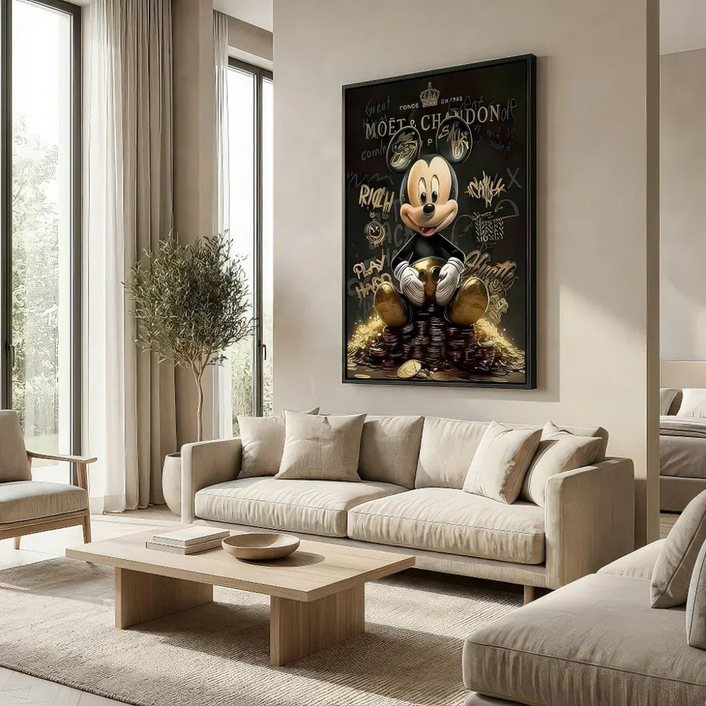
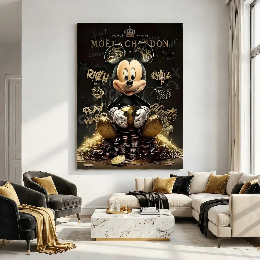
Decorate Without “Decorating”: When the Basquiat Spirit Enters Your Home
Transposing this energy indoors means accepting that the wall speaks. In a wall decoration approach, a visual inspired by street art is not an added motif: it is a focal point that organizes the room. Some simple guidelines:
-
The Format: Basquiat likes amplitude; indoors, a large vertical above a sofa or a wide horizontal can structure the space.
-
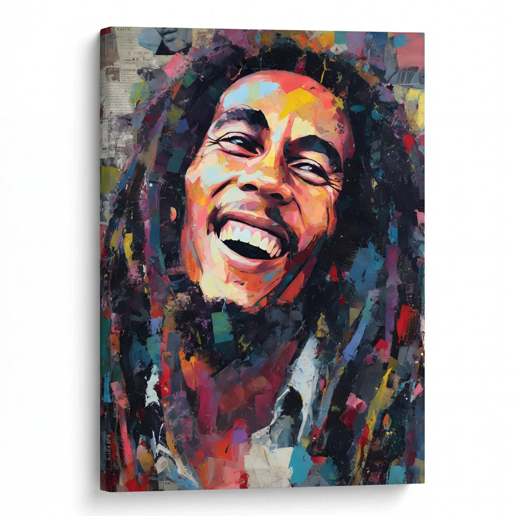
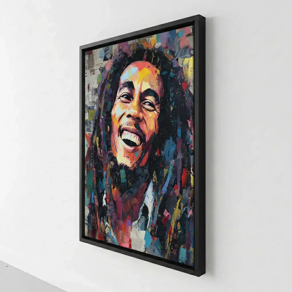
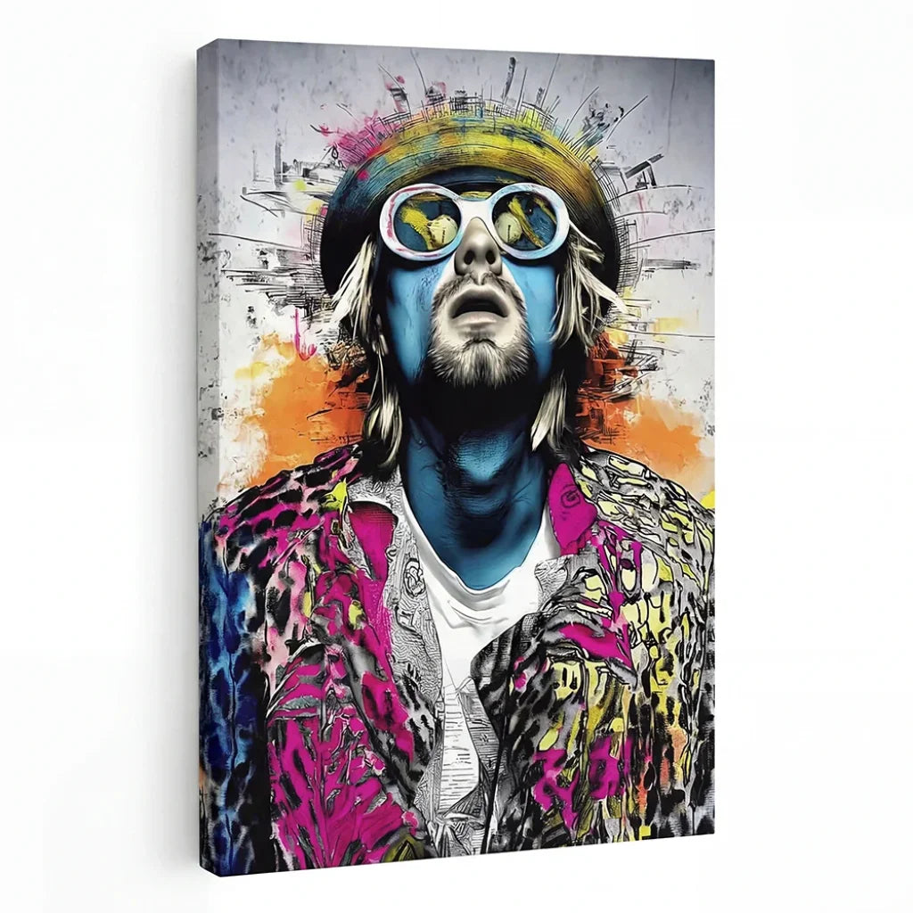
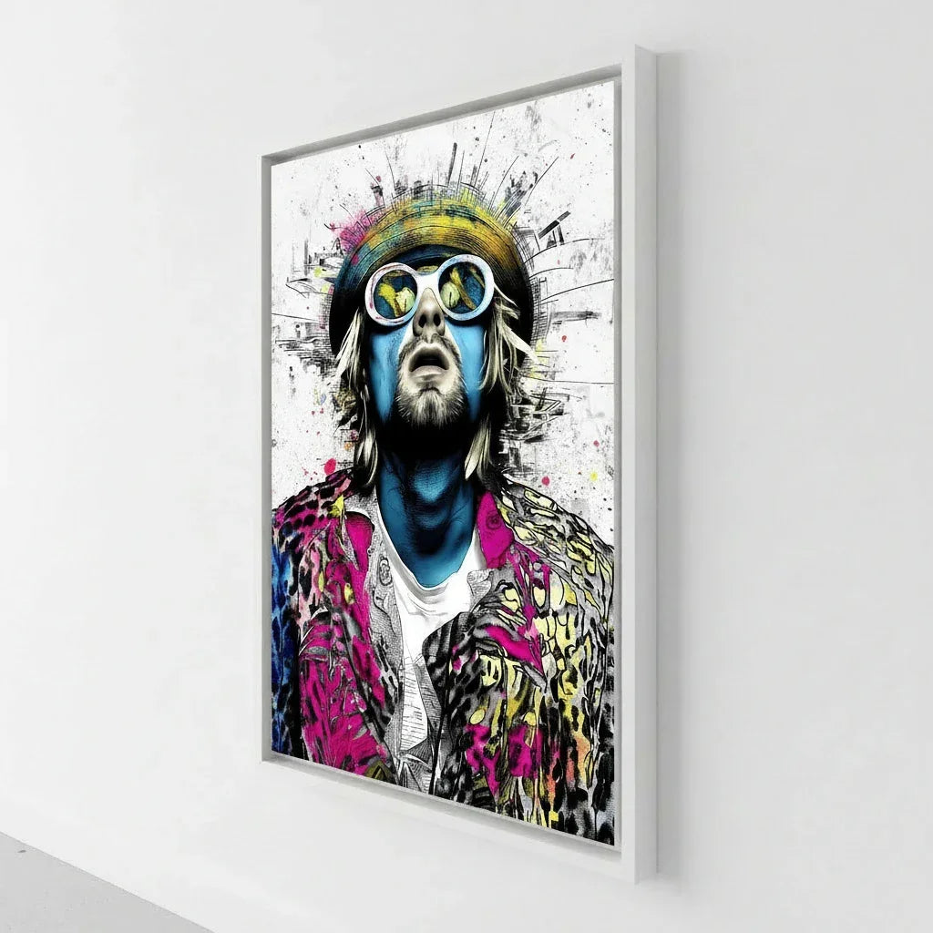
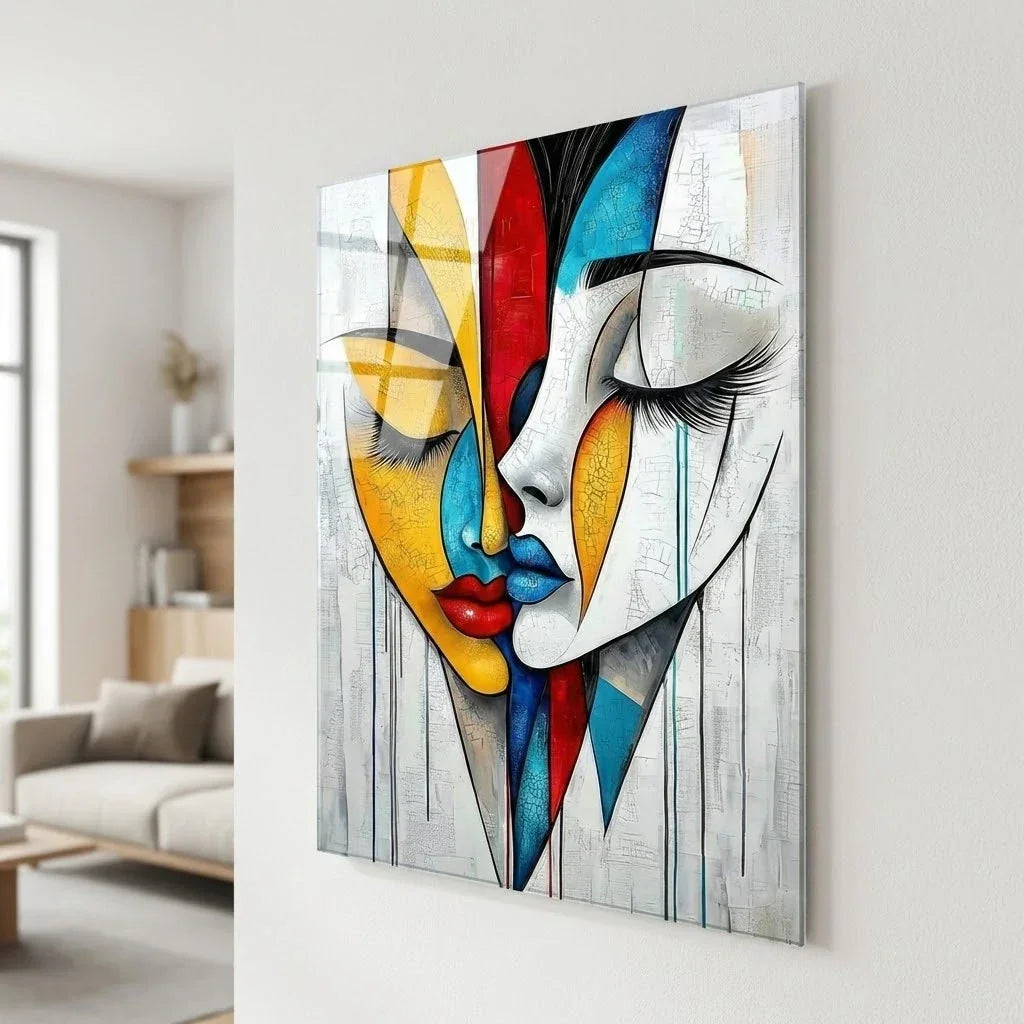
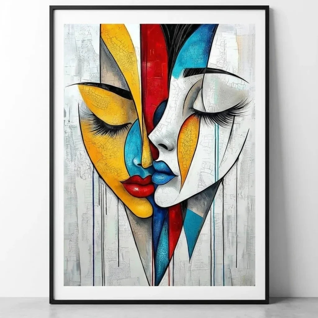
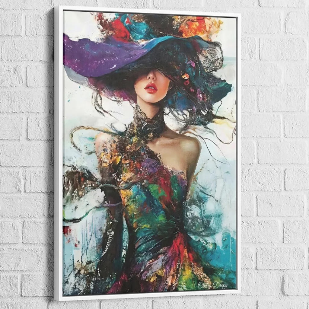
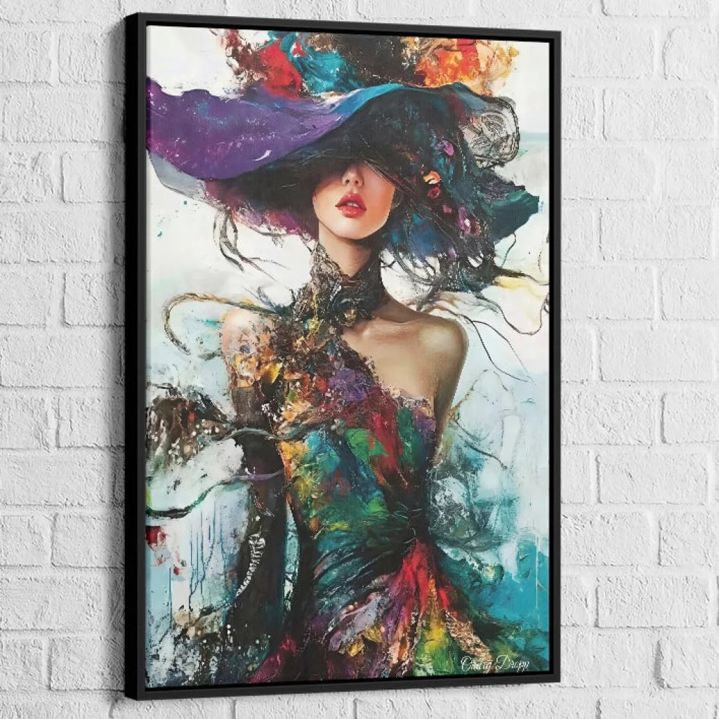
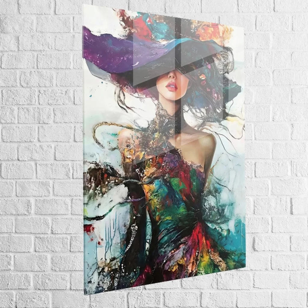
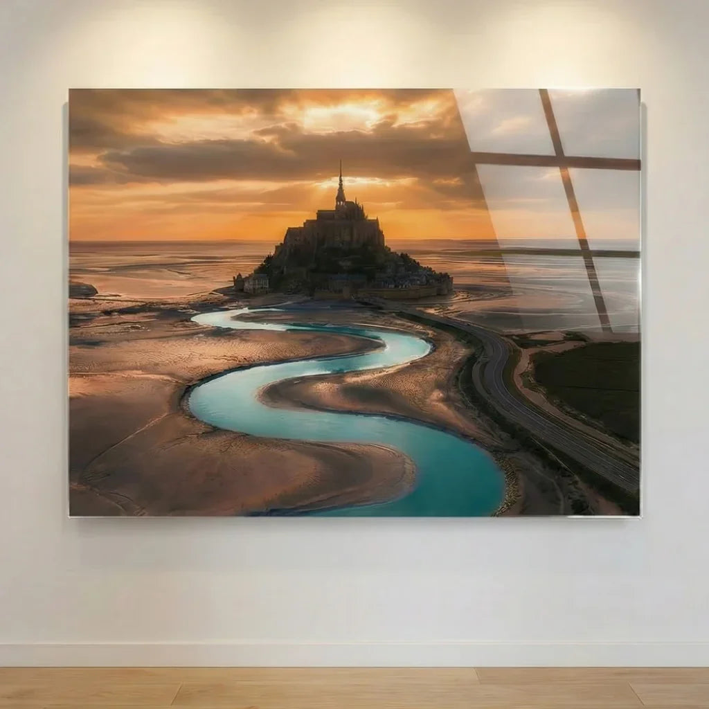
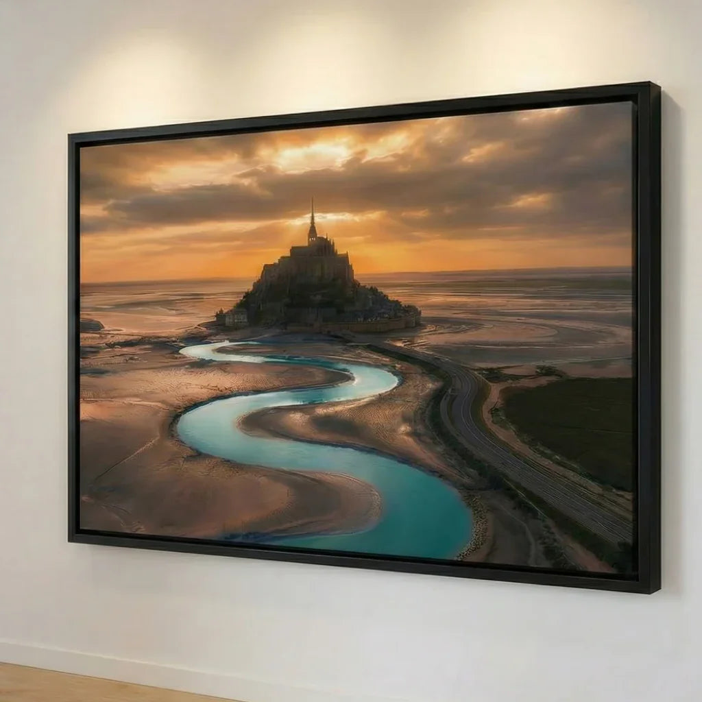
The Material: a textured canvas restores the warmth of the gesture and layers; a floating frame refines the line; an acrylic/plexiglass support intensifies blacks and gloss for a more graphic rendering.
-
The Light: a very lit wall supports strong contrasts; a softer area highlights superimpositions and nuances.
-
The Dialogue: combine light wood, concrete, metal, sober textiles; leave breathing space around the work, like silences between two riffs.
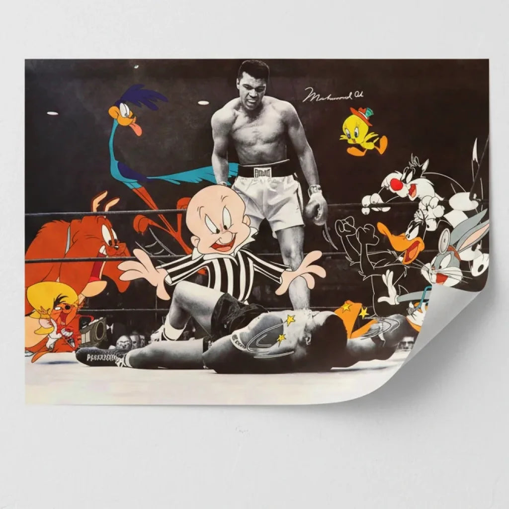
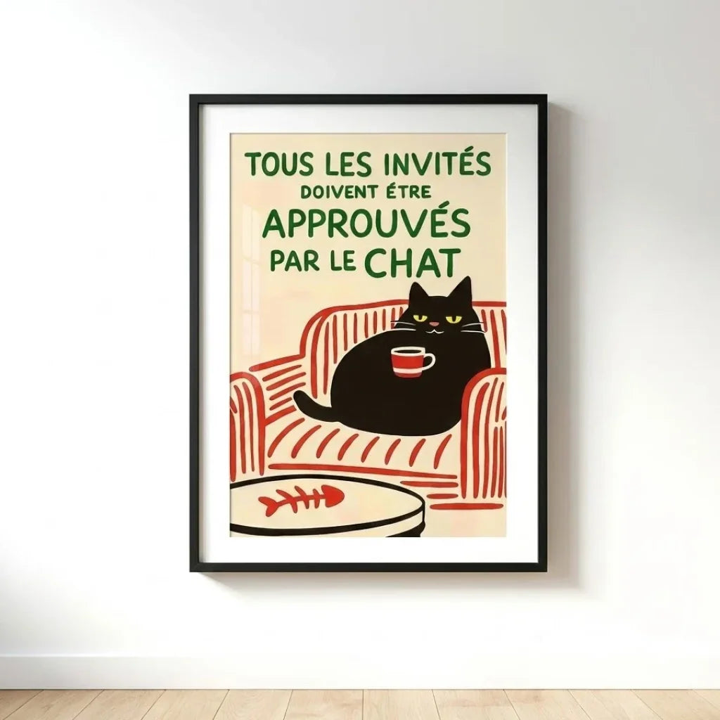
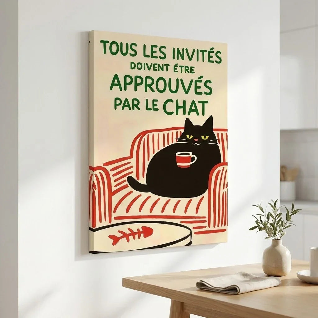
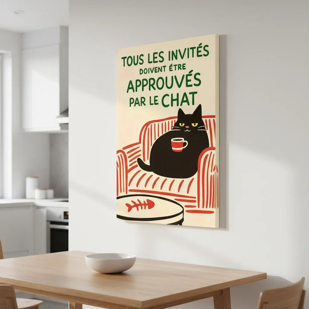
If you want to explore visuals that borrow from this writing (crowns, words, anatomies, sharp contrasts), you can browse our selection of Basquiat paintings: the idea is not to copy, but to extend a spirit — rhythm, collisions, memory — in a living interior.
Ethics and Fidelity: Drawing Inspiration Without Appropriation
Street art is born in public space, with its share of ephemeral, sharing, and circulation. At home, prioritize legal reproductions, original interpretations, visuals that quote without appropriating. Avoid literal appropriation; prefer a writing (stencils, fonts, anatomies, lists) to a signature. This attention is not a detail: it makes the whole coherent. The work becomes a relay rather than a trophy; it continues the dialogue with the city instead of archiving it.
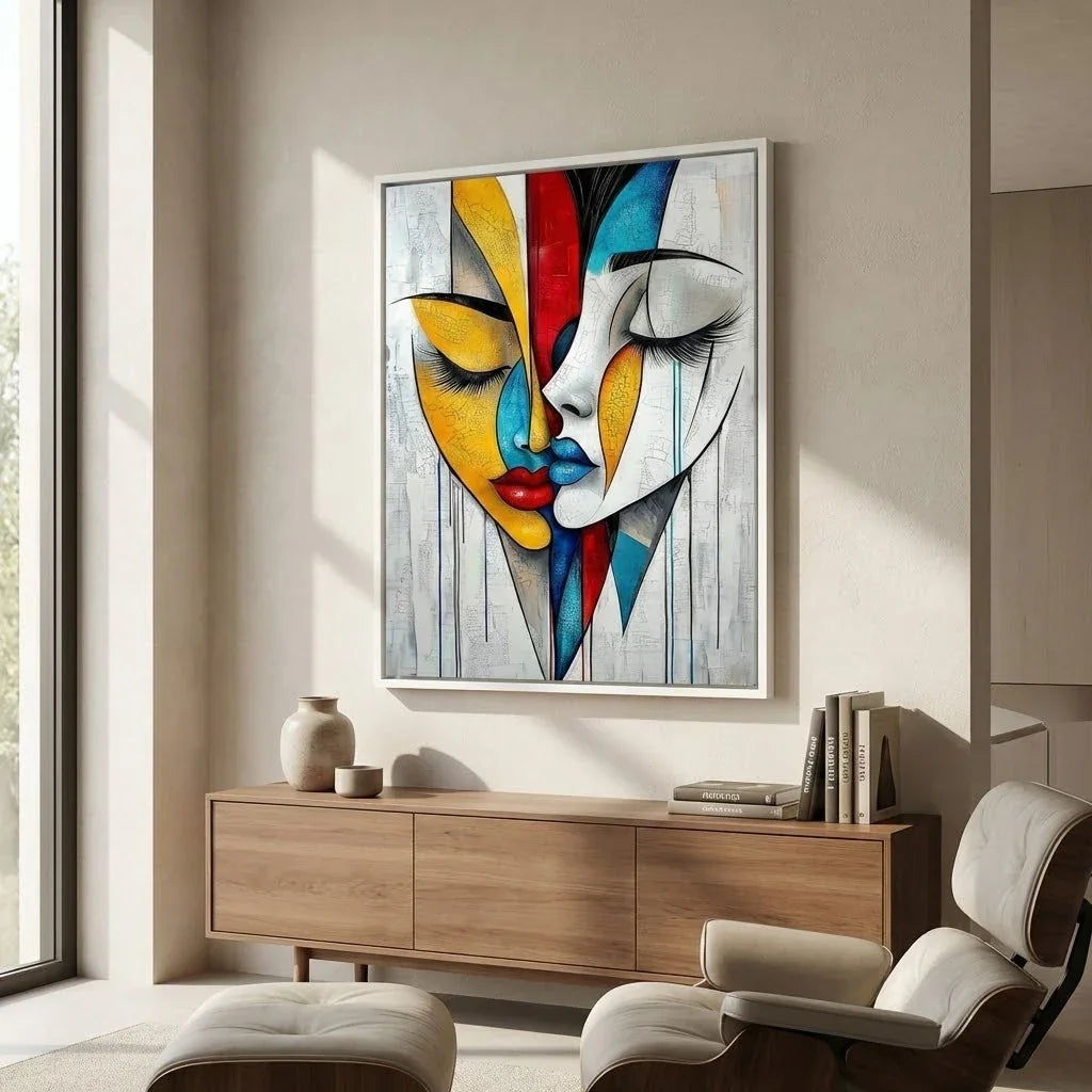
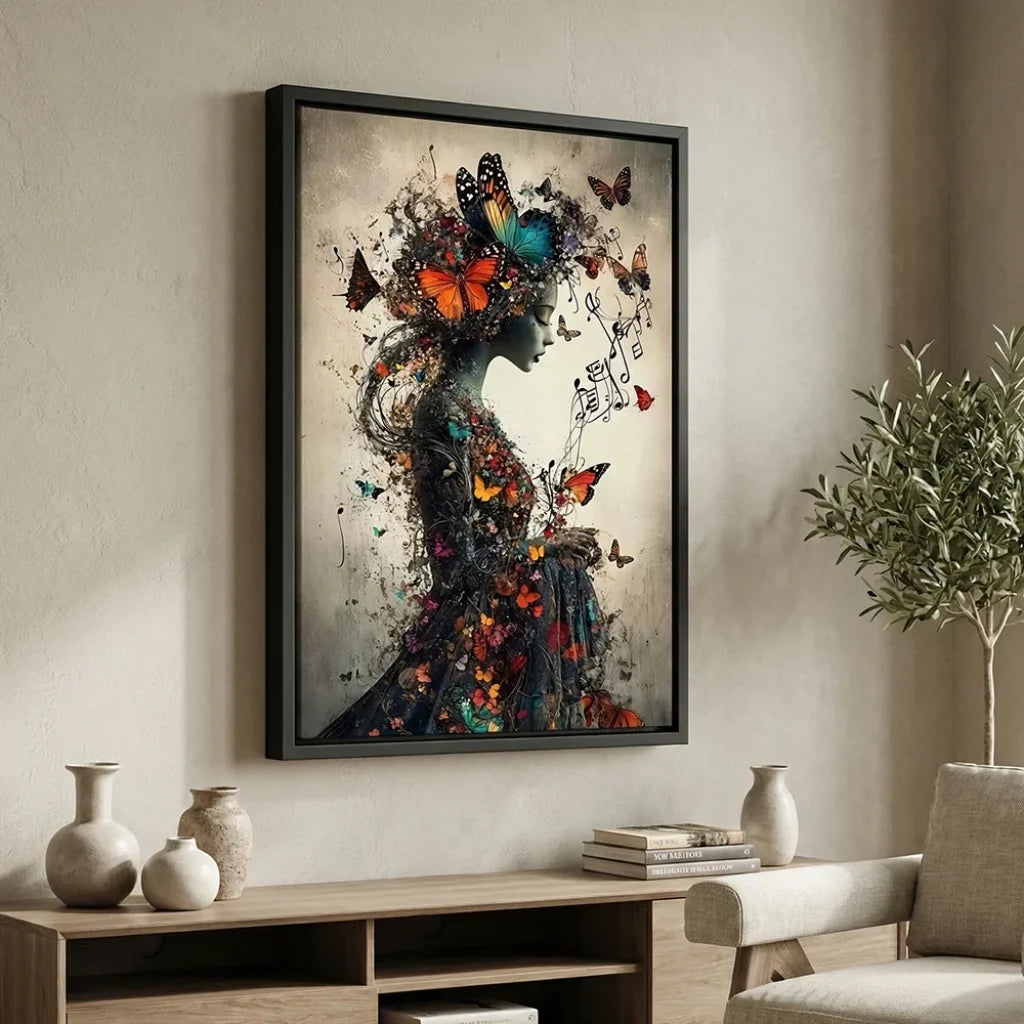
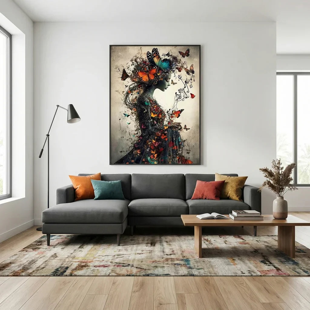
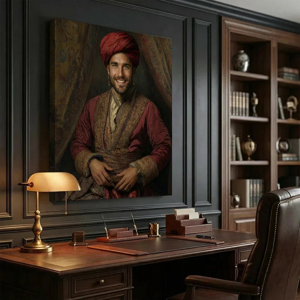
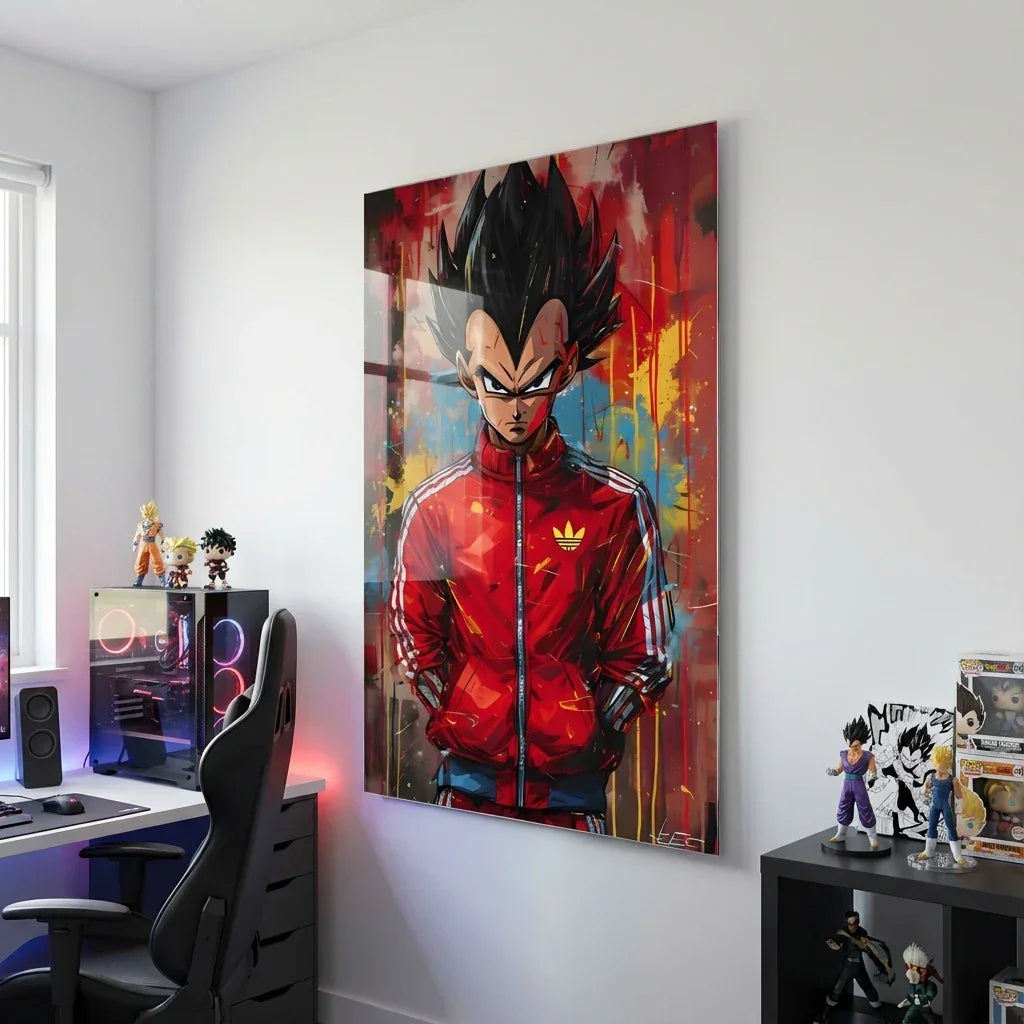
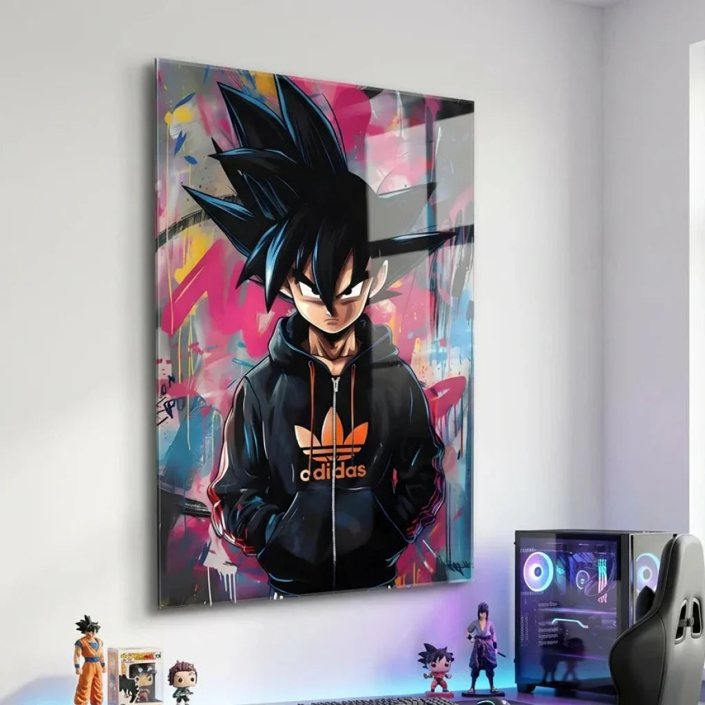
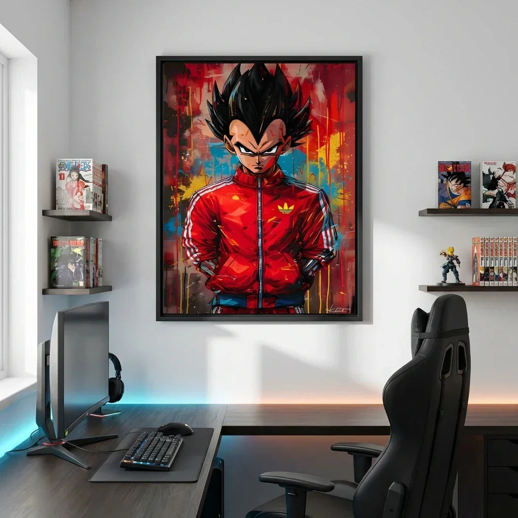
Staging Tips (Simple and Effective)
-
One Strong Gesture: better a large format well placed than a scattering of small frames.
-
Controlled Palette: if the work is very saturated, keep floors and textiles sober (linen, wool, cotton, wood).
-
Height: center of the work at 1.55 m–1.60 m from the floor (museum reference); in a living room, adapt according to seating.
-
Alignments: the bottom line on a sideboard or a sofa helps the eye; avoid “random” offsets.
-
Light: favor a soft grazing light; avoid spots too close that create harsh reflections.
Why It Still Resonates
Because Basquiat’s canvases meet two contemporary expectations:
-
Say Quickly, Hit Precisely — an image-phrase, an idea held in a few signs.
-
Leave Depth — layers, corrections, clues, something to reread.
In an interior, this double promise works wonderfully: you see first (the visual shock), then you return (the details). The wall ceases to be decorative; it becomes narrative.